
Every product team faces the same problem: too many feature ideas, not enough time or budget to build them all. The Kano Model gives you a disciplined way to decide which features to prioritize — not based on gut feel or whoever argues loudest in the room, but on a clear understanding of how each feature actually affects customer satisfaction.
This guide covers everything you need to run a Kano analysis from scratch: the five categories, how to write the questionnaire, how to score and classify results, and how to run the workshop with your team.
What Is the Kano Model?
The Kano Model is a framework for classifying product features based on how they affect customer satisfaction relative to how fully they’re implemented. It was developed by Dr. Noriaki Kano at Tokyo Rika University and first published in 1984 in a landmark paper in the Journal of the Japanese Society for Quality Control — co-authored with Nobuhiko Seraku, Fumio Takahashi, and Shin-ichi Tsuji — which has since accumulated over 3,600 academic citations.
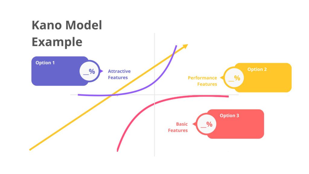
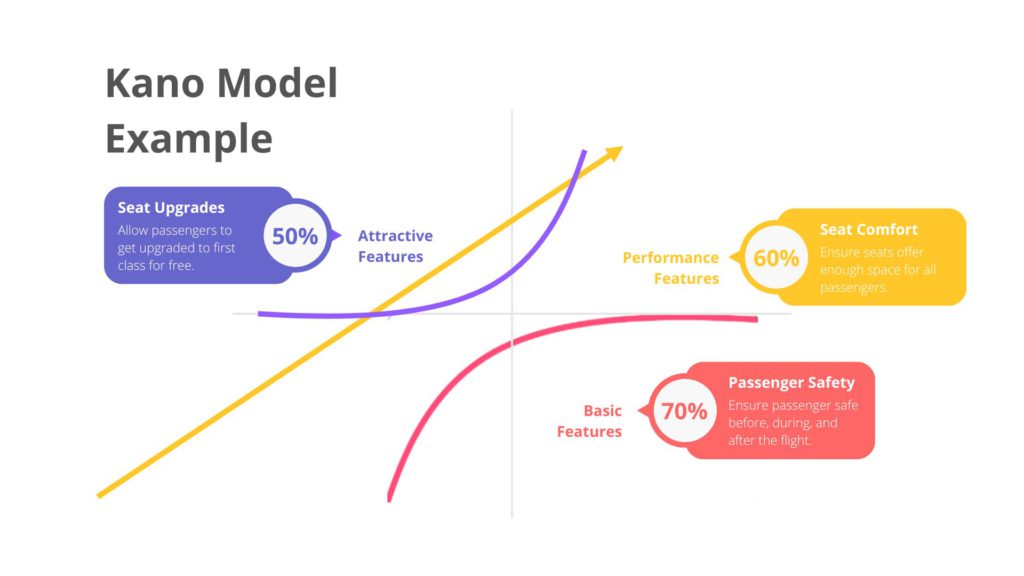
The core insight is that not all features contribute to satisfaction equally. Some features are expected — their absence causes dissatisfaction, but their presence goes entirely unnoticed. Others generate satisfaction proportional to how well they’re executed. And a third class of features — the ones teams fight hardest to discover — create disproportionate delight when they exist, because customers never expected them at all.
Understanding which category each feature falls into changes every resourcing and prioritization decision your team makes.
The Five Kano Categories
1. Must-Be Features (Basic Needs)
These are the minimum requirements a product must meet. Customers don’t mention them in research because they assume they’ll be there — until they aren’t, at which point dissatisfaction spikes sharply.
A car that locks. A mobile app that doesn’t crash on launch. A hotel room with running water. No amount of polish elsewhere compensates for a missing Must-Be feature. Investing beyond the baseline threshold of these features produces no additional satisfaction — customers simply expect them to work.
What this means for prioritization: Must-Be features must be present and functional before anything else. They rarely appear on customer wish lists, which makes them easy to overlook during feature planning — and catastrophic to miss.
2. Performance Features (One-Dimensional)
These features have a linear relationship with satisfaction: the more you deliver, the more satisfied customers become; the less you deliver, the more dissatisfied they become. They’re the features customers explicitly mention when asked what they want, and the ones competitors benchmark against each other.
Battery life on a laptop. Delivery speed on an e-commerce platform. Image quality on a camera. Fuel economy in a car. Performance features are where most product roadmaps spend the majority of their focus — and rightly so, since customers are actively evaluating them.
What this means for prioritization: Improvements here produce reliable, measurable satisfaction gains. These are your competitive levers.
3. Attractive Features (Delighters)
Attractive features create satisfaction when present but cause no dissatisfaction when absent — because customers didn’t expect them. These are the features that generate word-of-mouth, earn press coverage, and drive the kind of loyalty that’s impossible to buy with performance improvements alone.
The first hotel to offer bedside USB charging ports created delight. The first airline to offer seat-back entertainment screens created delight. Within a few years, both became Must-Be features — which illustrates an important dynamic: Attractive features decay over time as customer expectations rise. The Interaction Design Foundation documents this decay pattern in detail, noting that what once delighted customers eventually becomes baseline expectation as markets mature.
What this means for prioritization: Delighters are your highest-risk, highest-reward investments. Finding them before competitors do is a structural advantage. The Kano survey is designed specifically to surface them.
4. Indifferent Features
These features neither increase satisfaction when present nor decrease it when absent. Customers simply don’t care about them — they’re invisible either way.
This is often uncomfortable for product teams to hear, because features classified as Indifferent typically represent real engineering effort. The Kano analysis surfaces this clearly: if a feature is Indifferent, building it more fully is a pure cost with no customer satisfaction return.
What this means for prioritization: Cut or deprioritize. Redirect resources to Performance or Attractive features.
5. Reverse Features
These are features a significant segment of customers actively dislike. Their presence creates dissatisfaction. This is the smallest and most surprising category — and the one that most product teams never discover because they don’t ask the right questions.
What this means for prioritization: Avoid building these features for the affected segment, or ensure they’re optional and easily disabled.
A note on category decay: Kano categories are not permanent. Attractive features of one decade become Performance features of the next, and eventually Must-Be requirements. What delighted iPhone users in 2007 (a touchscreen) is now table stakes for every smartphone. Running Kano analysis periodically — not just at product launch — accounts for this shift.

How to Run a Kano Analysis: Step by Step
Step 1: Define the Feature List
Compile the features you want to evaluate. Good sources include: customer support tickets, sales call recordings, NPS feedback, competitor review analysis, and internal roadmap debates. Aim for 10–20 features per survey — enough to be meaningful, not so many that respondents disengage.
Write each feature as a concrete, specific statement rather than an abstract concept. "Automatically saves progress every 30 seconds" is testable. "Better saving" is not.
Step 2: Write the Kano Questionnaire
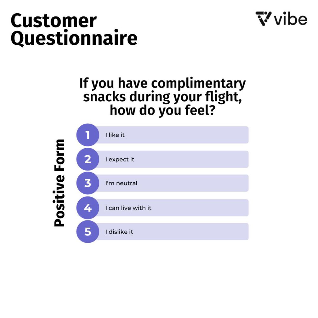
The Kano survey asks two questions per feature — a functional question and a dysfunctional question:
-
Functional: "If this feature were present, how would you feel?"
-
Dysfunctional: "If this feature were absent, how would you feel?"
Both questions use the same five-point response scale:
|
Response |
Label |
|---|---|
|
1 |
I like it |
|
2 |
I expect it |
|
3 |
I am neutral |
|
4 |
I can tolerate it |
|
5 |
I dislike it |
Example — an auto-save feature in a project management tool:
-
Functional: "If the tool automatically saved your work every 30 seconds, how would you feel?"
-
Dysfunctional: "If the tool did not automatically save your work, how would you feel?"
A respondent who answers "I like it" to the functional question and "I dislike it" to the dysfunctional question is signalling a Must-Be or Performance feature. A respondent who answers "I like it" functionally but "I am neutral" dysfunctionally is signalling an Attractive feature.
Step 3: Classify Responses Using the Kano Evaluation Matrix
Cross-reference each respondent’s functional and dysfunctional answers using this matrix:
|
Like |
Expect |
Neutral |
Tolerate |
Dislike | |
|---|---|---|---|---|---|
|
Like |
Questionable |
Attractive |
Attractive |
Attractive |
Performance |
|
Expect |
Must-Be |
Indifferent |
Indifferent |
Indifferent |
Performance |
|
Neutral |
Must-Be |
Indifferent |
Indifferent |
Indifferent |
Performance |
|
Tolerate |
Must-Be |
Indifferent |
Indifferent |
Indifferent |
Performance |
|
Dislike |
Reverse |
Reverse |
Reverse |
Reverse |
Questionable |
Rows = functional response. Columns = dysfunctional response. "Questionable" responses — such as "I like it" to both questions — indicate a misunderstood question and should be excluded from analysis.
Step 4: Aggregate and Prioritize
Once you’ve classified each respondent’s answers, tally the category distribution for each feature. A feature where 60% of respondents classify it as Must-Be and 30% as Performance should be treated very differently from one where 50% say Indifferent and 30% say Attractive.
Common approaches for final prioritization:
-
Mode method: Assign each feature to whichever category received the most votes.
-
Satisfaction/Dissatisfaction coefficients: Calculate the average satisfaction gain if the feature is present versus the average dissatisfaction if it’s absent. Features with high dissatisfaction coefficients are Must-Be; those with high satisfaction coefficients are Attractive. This coefficient method is explained in detail in Productboard’s prioritization framework guide alongside comparisons with RICE and MoSCoW for teams that want to weigh Kano output against other models.
The second method is more nuanced and is recommended when category votes are split or when you want to compare features quantitatively across the full list.
Step 5: Run the Workshop
Data without a team conversation is just a spreadsheet. The Kano analysis produces its best output when reviewed collaboratively — ideally with product, design, engineering, and customer-facing stakeholders in the same room.
The goal of the workshop is not to debate the data, but to make resourcing decisions based on it. A typical agenda:
-
Present the category distribution for each feature (15 min)
-
Flag Must-Be gaps — features that are Must-Be but currently missing or underbuilt (10 min)
-
Identify Attractive feature candidates worth investing in (20 min)
-
Mark Indifferent features for removal from the roadmap (10 min)
-
Map final priorities onto the roadmap with owners and timelines (15 min)
For hybrid teams — where some participants are in the conference room and others are joining remotely — running this workshop on a shared visual canvas prevents the common failure mode where remote participants fall behind the in-room conversation. The Vibe Board S1 gives in-room teams a large-format, touch-enabled surface while remote participants access and contribute to the exact same canvas simultaneously through Vibe Canvas. Feature categories can be plotted visually, sticky notes added in real time, and the final prioritization decision is captured automatically in the cloud — no whiteboard photos, no lost context. If your team runs regular whiteboarding sessions for product decisions, the Kano workshop slots naturally into the same workflow.
A Kano Questionnaire Example
Here is a sample functional/dysfunctional question pair for five features of a project management tool:
Feature 1: Automatic progress saving
F: "If the app saved your work automatically every 30 seconds, how would you feel?"
D: "If the app did not save your work automatically and you had to save manually, how would you feel?"
Feature 2: AI-generated task summaries
F: "If the tool automatically generated a plain-language summary of each task’s status at the end of each week, how would you feel?"
D: "If the tool did not generate task summaries and you had to write them manually, how would you feel?"
Feature 3: Dark mode
F: "If the tool offered a dark mode interface, how would you feel?"
D: "If the tool did not offer dark mode, how would you feel?"
Feature 4: Voice command support
F: "If you could control the tool entirely by voice commands, how would you feel?"
D: "If voice command support were not available, how would you feel?"
Feature 5: Offline access
F: "If you could access and edit tasks without an internet connection, how would you feel?"
D: "If the tool required an internet connection at all times, how would you feel?"
In a real survey, include a brief open-ended question after each pair: "Why did you give this answer?" The qualitative responses often reveal more nuance than the scaled answers alone.
When to Use the Kano Model
The Kano analysis is most valuable in four situations:
Before a major release or roadmap cycle. When the team has generated more ideas than can be built, Kano provides an objective basis for cutting the list. Research from Productboard found that 49% of product managers report difficulty prioritizing without sufficient customer data — the Kano survey directly addresses this gap by grounding decisions in structured customer input rather than internal opinion.
When entering a new market or customer segment. What’s Attractive to enterprise buyers may be Must-Be for SMBs, or vice versa. Kano survey data segmented by customer type reveals these differences clearly.

When NPS or satisfaction scores are declining without an obvious cause. Features may have decayed from Attractive to Must-Be while still being treated as differentiators. Kano resurfaces this shift.
Before killing a feature. If a feature has low usage data, the instinct is to remove it. Kano survey data may reveal it’s a Must-Be for a segment — invisible in usage logs precisely because users don’t consciously engage with it, but deeply missed if it disappears.
Limitations of the Kano Model
No framework is a substitute for judgment, and the Kano Model has known constraints worth understanding before you rely on it:
It’s a point-in-time snapshot. Categories shift as markets evolve. A Kano analysis from 18 months ago may not reflect current customer expectations. Build it into your regular research cadence rather than running it once.
It depends on respondent quality. Customers often struggle to evaluate features they haven’t experienced. Attractive features are particularly difficult to assess — customers can’t always articulate how they’d feel about something they’ve never seen. Complement survey data with usability testing and concept validation for new feature ideas.
It doesn’t capture relative importance across categories. The Kano model tells you which category a feature belongs to, but not how important it is relative to other features in the same category. Pair Kano with a relative importance survey (such as Max-Diff scaling) for a more complete prioritization picture.
Sample size matters. Results from fewer than 30 respondents should be treated as directional, not conclusive. For enterprise products with a small customer base, supplement the survey with in-depth interviews using the same functional/dysfunctional question structure.
FAQs
What are the five categories of the Kano Model?
Must-Be (Basic), Performance (One-Dimensional), Attractive (Delighter), Indifferent, and Reverse. Must-Be features cause dissatisfaction when absent but go unnoticed when present. Performance features produce satisfaction proportional to implementation. Attractive features create delight when present but no dissatisfaction when absent. Indifferent features have no effect either way. Reverse features actively displease a segment of customers when present.
How many questions does a Kano survey have?
Two questions per feature — one functional ("if this feature were present, how would you feel?") and one dysfunctional ("if this feature were absent, how would you feel?"). For a survey covering 15 features, that’s 30 scaled questions plus optional open-ended follow-ups.
How do you classify Kano survey results?
Cross-reference each respondent’s functional and dysfunctional answers using the Kano Evaluation Matrix to assign a category for that respondent. Aggregate category classifications across all respondents to find the dominant category for each feature.
How is the Kano Model different from MoSCoW prioritization?
MoSCoW (Must Have, Should Have, Could Have, Won’t Have) is an internal team decision about implementation priority. The Kano Model is built from customer data about satisfaction impact. Kano tells you how customers would actually respond to a feature; MoSCoW tells you what the team has decided to build given constraints. The two are complementary — Kano output can directly inform MoSCoW classifications. For a side-by-side comparison of both methods alongside RICE and other frameworks, Product School’s prioritization guide is a practical reference.
Can the Kano Model be used for service design, not just software products?
Yes. Dr. Kano developed the model in the context of manufacturing and service quality. It applies equally to hospitality, healthcare, financial services, and any other service context where you want to understand how specific service attributes affect customer satisfaction.
How often should you run a Kano analysis?
Annually at minimum, and before any major roadmap or product strategy decision. Feature categories shift as customer expectations evolve and competitors raise the baseline — what was Attractive three years ago may now be Must-Be.