Ever sat through a meeting full of charts and spreadsheets but walked away unsure what it all meant? You’re not alone. Numbers can be impressive on screen, but without context, they’re just… numbers. When critical data insights fail to translate into action, organizations miss key opportunities and waste valuable resources. That’s where data storytelling can make all the difference.
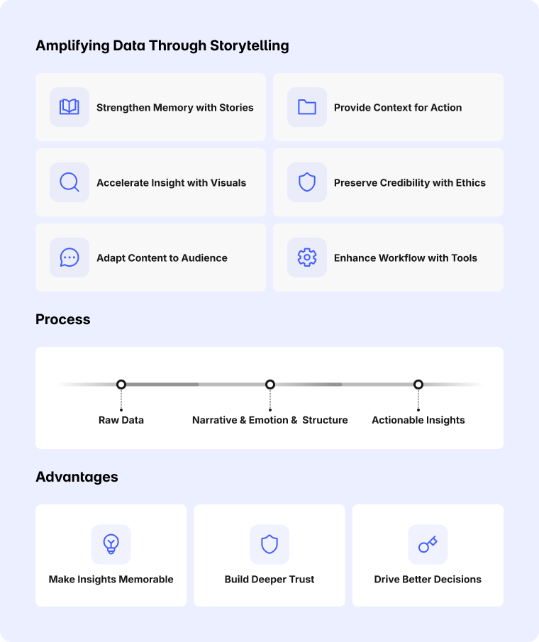
Data-driven storytelling uses narrative and visuals to transform raw data into something people can actually connect with and act on. Instead of dumping statistics into a slide deck, it frames insights within a relatable story that explains what’s happening and why it matters. This approach helps cut through information overload to turn complex datasets into something clear and memorable. Keep reading to learn more about how storytelling enhances data, and 6 tips for maximum impact.
- Data storytelling combines narrative, visuals, and context to make information clear and memorable.
- Stories trigger emotions that help audiences retain and recall information.
- A clear structure turns complex data into something people can follow and act on.
- Pairing insights with the right visuals deepens understanding and engagement.
- Ethical and accurate data-driven storytelling builds trust and credibility.
How Data is Amplified with Storytelling
Most teams don’t need more charts—they need a clearer path from finding to decision, and that’s where data storytelling earns its keep. The goal isn’t prettier visuals; it’s a tighter narrative that makes the signal obvious, the takeaway undeniable, and the next step owned. Use the quick guide below to turn raw metrics into decisions with context, the right visual, and a concrete action:
Stories improve memory and focus
Stories add emotion and context, making data easier to encode and recall, so insights actually stick. Data storytelling translates abstract numbers into relatable moments that convert attention into action.
Structure clarifies complexity
A simple arc guides audiences from context to conclusion without getting lost in metrics. Use What → Why → So What → Now What to surface meaning and end with a specific action and owner.
Visuals accelerate understanding
The right visual makes the point obvious in seconds; the wrong one adds friction and doubt. Match the question to the form and annotate the takeaway directly on the visual.
Technology amplifies the workflow
Modern tools surface patterns and draft narrative scaffolding, shifting effort from gathering to deciding—this sets up Tip #6 on choosing the right collaboration stack.
Ethics sustain trust
Transparency about sources, methods, and limitations preserves credibility and mitigates bias. Distinguish correlation from causation and use a brief "confidence and caveats" note to keep data storytelling honest.
Visual Selection Cheat Sheet
Use this as the single authoritative reference for chart choice and basic formatting. Keep other sections focused on narrative and action, and simply point back here when needed.

-
Trends over time: line charts with direct labels; annotate inflection points; limit to three series.
-
Ranking/comparison: horizontal bars, sorted descending; 0-baseline; one highlight color for the focal category.
-
Part-to-whole: stacked bars for a few categories; small multiples if many; avoid decorative pies.
-
Relationship: scatter with a trendline/band; label 2–3 notable points rather than all.
-
Distribution: histogram or box plot; show median and IQR; call out outliers with brief notes.
-
Universal formatting: one accent color for the takeaway; everything else in gray; remove chartjunk; use claim-first titles.
Common Pitfalls in Data Storytelling to Watch For
The rabbit hole pitfall: telling the analysis journey instead of the story
It’s tempting to replay every step—queries, pivots, and tests—but walking through the entire path overwhelms attention and buries the point. Audiences don’t need the breadcrumb trail; they need the moment of truth and what to do next. Reframe the narrative as baseline, change, driver, and decision; put the detective work in an appendix.
-
Do this instead: open with the decision in one line, show one chart that proves it, list 2–3 drivers, and close with Now What (owner, KPI, date). Keep methods and sensitivity in a linked appendix.
The mirror maze pitfall: visuals that look smart but don’t say anything
Dashboards, dual axes, and rainbow palettes can look impressive while saying almost nothing. When the form doesn’t match the question—or clutter competes with the takeaway—interpretation splinters and trust erodes. Choose the minimum‑effective visual aligned to the claim; use one highlight color; title slides as conclusions, not topics.
-
Do this instead: use the Visual Selection Cheat Sheet above; pair with claim-first titles, direct labels, and a single annotation at the precise decision point.

The fog of context pitfall: insights without baselines, benchmarks, or next steps
A metric without a reference frame invites debate rather than action: is +7% good, bad, or noise? Without a time window, segment, and benchmark, significance is ambiguous—and without a named owner and date, momentum stalls. Context turns numbers into decisions by showing where we stand against what matters; action converts agreement into movement.
-
Do this instead: use Benchmark → Baseline → Delta → Decision plus a micro-note on data window, method, exclusions, and confidence. Translate So What into Now What with a DRI, KPI threshold, due date, and a 30‑day review.
6 Tips for Maximizing the Impact of Data Storytelling
When the stakes are high, the difference between success and falling flat can come down to the story wrapped around the numbers. The following tips turn data storytelling into a repeatable practice—shaping relatable context, sharpening structure, and choosing visuals that make the signal undeniable. Use them to move teams from "interesting" to "acting" with clarity, speed, and confidence.
1. Use stories to make data relatable and memorable
Stories give numbers human stakes and recognizable context, making complex insights easier to process and harder to forget. Anchor the narrative in a persona, a moment, or a decision at risk so audiences see themselves in the situation and understand why it matters now. By translating metrics into lived scenarios, data storytelling converts passive interest into urgency and ownership.
-
Get started: begin with a one-line vignette ("A new SMB admin churned after 72 hours of silence"), reveal the key metric shift, and end the beat with a concrete next step and owner. Add "who/what/how much/by when" to quantify impact and make the action irresistible.
2. Pair narratives with visuals that clarify, not distract
Visuals should make the claim obvious in five seconds; anything slower adds friction and invites debate. Title each visual as a claim, not a topic, and keep palettes disciplined: neutral for context, one highlight color for the takeaway. For chart choice, follow the Visual Selection Cheat Sheet above rather than stacking multiple visuals per point.
-
Get started: write the slide title as "X drove Y; do Z by T," then choose a single chart that proves it. Replace legends with direct labels, remove chartjunk, and add one clear annotation at the exact decision point.

3. Tailor content and complexity to the audience’s needs
Different audiences speak different "data languages," so shape the same story at three depths. Executives need the answer, impact, and risk; managers need drivers and forecasts; analysts need methods and sensitivity. This layering preserves speed without sacrificing rigor, ensuring the story lands for everyone.
-
Get started: build one master narrative, then produce three views—Exec (1 slide), Manager (3–5 slides), Analyst (appendix). If time is short, lead with the answer; let stakeholders "pull" depth via linked sections.
4. Provide clear context so data drives action, not confusion
Data without context becomes noise; context turns insight into decision. Always show baseline, benchmark, time window, and segment so the significance is self-evident. Then bridge to action with thresholds ("if X > Y, do Z"), owners, and dates to convert "So What" into "Now What."
-
Get started: use Benchmark → Baseline → Delta → Decision and include a one-line "confidence & caveats" note. If the recommendation depends on an assumption, show a small sensitivity range so that commitment is informed.
5. Maintain accuracy and ethics to build trust
Trust compounds when the narrative is transparent about sources, methods, exclusions, and limitations. Distinguish correlation from causation and surface plausible alternative explanations, even when they don’t change the call. Ethical data storytelling earns faster buy‑in today—and more leeway for bold recommendations tomorrow.
-
Get started: add a micro-footnote on each decision slide with data window, method, exclusions, confidence, and a counterfactual. State the main risk to the recommendation and how it’s being mitigated to preempt skepticism.
6. Use the right tools to speed collaboration and clarity
Great data storytelling isn’t just analysis and slides; it’s the workflow that gets teams aligned quickly and keeps context intact across meetings. Choose tools that enable real-time co-creation, on-visual annotation, and persistent canvases where models, notes, and decisions live together. Look for seamless integrations with conferencing and cloud apps, plus features like handwriting recognition and high‑fidelity displays for hybrid rooms.
-
Get started: standardize a "story workspace" that combines your deck, key charts, and a live whiteboard for markups; assign an owner per decision and capture changes in the same canvas.
Elevate Your Data Storytelling with Vibe Board S1
Turning complex insights into engaging stories is easier when your tools work with you, not against you. That’s where the Vibe Board S1 shines. Trusted by over 40,000 leaders, this purpose-built smart whiteboard is designed for collaboration and compelling presentations. With a 4K touchscreen and AI-powered camera, you can excel at presenting data visually, annotate key points, and keep remote participants fully engaged.
Team brainstorm sessions become more dynamic as teams can draw, mark up, and refine data insights together — all in one place. Seamless integration with over 250 applications, including popular conferencing apps and cloud platforms, keeps everything connected, while AI handwriting recognition means your notes stay clear. With Vibe Board S1, data storytelling isn’t just easier — it’s more impactful.
Request a demo today and see how Vibe can help you bring your data stories to life.
 Team using a Vibe Board for visual data storytelling in a collaborative meeting.
Data Storytelling FAQs
1. What is data storytelling?
Data storytelling combines data, visuals, and narrative to explain insights in a way that’s easy to understand and remember. By framing numbers within a story, it helps audiences grasp complex information and see why it matters.
2. What are the four aspects of data storytelling?
-
Data: The factual foundation that supports the story.
-
Narrative: The logical flow that gives meaning and direction.
-
Visuals: Charts and graphs that clarify and reinforce the message.
-
Context: The background or situation that explains why the story matters.
3. What are the 5 P’s of storytelling?
-
People: Characters or subjects involved.
-
Place: The setting or environment where the story happens.
-
Plot: The sequence of events or developments.
-
Purpose: The reason the story is being told.
-
Point: The insight or takeaway the audience should remember.
4. Is data storytelling a skill?
Yes, it blends analytical thinking, design, and communication. Strong data storytelling skills require practice to balance narrative flow with accuracy, making complex insights both credible and compelling.
5. Why is data storytelling important in business?
It makes complex information accessible and aligns teams around shared meaning. By making data relatable and memorable, data storytelling can influence better, faster business decisions.


