If your company wants to meet its goals, you need to be able to keep constant tabs on all the moving pieces that go into your objectives. An OKR dashboard helps solve misalignment issues by turning your objectives and key results into a living, trackable source of truth that everyone can see and act on in real time. It keeps teams focused and accountable from planning through execution. Whether you’re setting quarterly goals or tracking daily progress, the dashboard transforms strategic intentions into measurable outcomes.
Read on to learn more about what OKR dashboards are, how they work, the different types available, and best practices.
- OKR dashboards help teams stay focused by making progress on objectives visible and measurable.
- They align individual and team efforts with broader company goals using real-time data.
- Dashboards come in many forms, from simple spreadsheets to advanced platforms with integrations or a tool like Vibe.
- Clear metrics, ownership, and regular check-ins are essential for dashboard success.
- When used correctly, OKR dashboards can improve accountability and clarity across the organization.
What is an OKR Dashboard and Why Does it Matter?
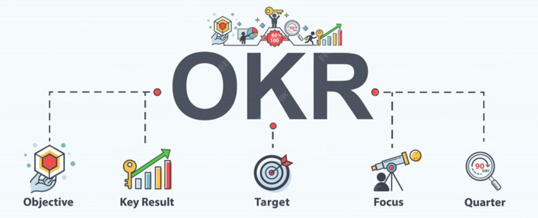
An OKR dashboard is a centralized tool that helps organizations track and align their goals using the OKR framework: objectives and key results. An objective defines what you want to achieve, while key results outline how you’ll measure success. The dashboard brings these elements together in a dynamic format, so teams can see their current progress at a glance. Because it updates in real time, it keeps everyone informed, accountable, and moving in the same direction.
Unlike KPI dashboards, which focus only on performance metrics like sales numbers or website traffic, OKR dashboards connect those metrics to a larger strategic purpose. They help answer not just "how are we doing?" but also "why does this matter?" By linking key results to meaningful objectives, the dashboard keeps teams motivated and aligned around impact.
The real power of an OKR dashboard lies in its ability to foster transparency and agility. Everyone can see how their work contributes to broader goals, which boosts engagement and accountability. At the same time, leaders can quickly identify what’s working and where adjustments are needed for smarter and faster decision-making.
How an OKR Dashboard Works in Practice
An OKR dashboard typically connects to the systems where key results are measured—like sales platforms, project management tools, or customer feedback systems. It pulls this data in real time and visualizes progress toward each objective, so teams always have an up-to-date view of where things stand. The dashboard often includes graphs, progress bars, and status indicators that make trends easy to spot at a glance. Color-coding—like green for on track, yellow for at risk, and red for off track—helps quickly highlight areas that need attention. This setup gives everyone from team leads to executives a clear view of progress across departments.
For example, imagine a marketing team aiming to increase qualified leads by 25% this quarter. Midway through, their OKR dashboard shows lead volume is strong, but quality is lagging, reflected by a red indicator on the "qualified" key result. Seeing this in real time, leadership shifts priorities: they pause a top-of-funnel campaign and reallocate resources to a more targeted lead-nurturing strategy. Without the dashboard’s clear signal, this adjustment might’ve come too late to help the team still meet their goal that quarter.
Types of OKR Dashboards
OKR dashboards can be tailored to serve different levels of an organization, from big-picture company goals to individual contributions. Each type plays a specific role in keeping the right people aligned and informed.
Team Dashboards
Team dashboards focus on the specific objectives and key results of a single department or cross-functional group.
For example, a product team might track metrics like feature delivery timelines or user satisfaction scores. These dashboards give team members a shared space to view progress, highlight roadblocks, and stay aligned on their part of the organization’s broader goals. The visuals—like progress bars and color-coded indicators—are tailored to the metrics that matter most to that team.
Consider a marketing team with the objective to "Increase brand awareness by 30% this quarter." Their dashboard tracks key results like boosting website traffic by 40%, improving social media engagement rates by 25%, and achieving a brand sentiment score of 4.2/5. Three weeks in, the dashboard shows website traffic surging ahead of target (green), but social engagement is flat (yellow) and brand sentiment is declining due to negative customer reviews (red). Seeing these mixed signals, the team quickly pivots: they pause their broad awareness campaign and launch a customer success story series to address sentiment issues. This real-time visibility allows them to course-correct before the quarter ends, turning potential failure into strategic success.

Company-Wide Dashboards
Company-wide dashboards give leadership and stakeholders a high-level view of all team OKRs in one place. They aggregate data across departments, helping executives understand how different teams are progressing toward shared strategic goals. This visibility supports better decision-making, faster resource reallocation, and clearer communication across the organization. These dashboards are especially useful during quarterly business reviews or all-hands meetings.
Take the executive team tracking a company-wide objective to "Achieve 25% revenue growth this fiscal year." Their dashboard aggregates progress from all departments: sales shows 30% growth in new customer acquisition (green), marketing reports 15% growth in qualified leads but conversion rates are dropping (yellow), and product development is 2 weeks behind on a key feature launch that could drive upsells (red). With this holistic view, leadership immediately sees the connection between delayed product features and declining conversion rates. They fast-track the feature development by reassigning engineers from a lower-priority project, preventing what could have been a significant revenue shortfall. Without the company dashboard’s integrated perspective, these departmental issues might have remained siloed until it was too late to recover.
Individual Dashboards
Individual dashboards are designed for personal OKRs, which might support career development, stretch goals, or specific performance targets. These dashboards are often used in one-on-one check-ins or performance reviews to track progress. Employees can see how their efforts connect to larger objectives, which helps drive engagement and ownership. Managers benefit, too, by having a clear, structured view of each person’s contributions.
Customizable/Hybrid Dashboards
Customizable or hybrid dashboards offer the most flexibility, combining elements from team, company, and individual views. These are especially useful for organizations with complex structures or evolving reporting needs. Users can filter data by department, timeframe, objective owner, or status to get the most relevant insights. They may include customizable widgets, goal hierarchies, or export options for reporting. This level of adaptability ensures that every stakeholder gets the visibility they need.
Benefits of Using an OKR Dashboard
By centralizing key performance data in a visual, easy-to-use format, teams can stay focused and leaders can respond quickly to what’s working and what’s not. These are some of the benefits of having an OKR dashboard like this.
1. Increased Alignment Across Teams
An OKR dashboard makes company objectives visible and understandable for everyone. This shared visibility helps ensure that each department and individual is working toward the same priorities. Team members can clearly see how their daily tasks contribute to overarching goals, which fosters a greater sense of purpose and collaboration. It also minimizes duplicated efforts and conflicting initiatives by keeping all teams informed and synced. With everyone pulling in the same direction, organizations can move faster and more effectively toward their strategic vision.
2. Real-Time Progress Tracking
Traditional goal tracking often lags behind reality. An OKR dashboard changes that by providing live updates based on integrated data sources. As key results shift—positively or negatively—teams can spot trends early and pivot their strategies accordingly. This real-time insight helps avoid surprises at the end of a quarter and keeps momentum going throughout the execution cycle. The ability to respond quickly turns OKRs from static plans into dynamic tools for performance management.
3. Better Accountability
With an OKR dashboard, everyone’s progress is visible. This shared view makes it easier to recognize high performers and identify areas where support may be needed. That can increase accountability because team members are motivated to meet their goals and contribute to shared success. It also encourages regular check-ins and discussions about roadblocks.
4. Data-Driven Decisions
With an OKR, leaders can use the most current data to guide their decisions. OKR dashboards aggregate performance metrics in a digestible visual format to make it easier to spot emerging patterns and assess the effectiveness of ongoing initiatives. This allows for smarter resource allocation, quicker course corrections, and more confident strategic planning.

Best Practices for Maintaining an Effective OKR Dashboard
A well-maintained OKR dashboard is essential for keeping goals relevant, visible, and actionable. Without regular upkeep, even the best tools can lose their impact. To get the most out of your dashboard, follow these best practices that promote clarity, focus, and team engagement:
-
Keep objectives clear and measurable. Write objectives in plain language, and pair them with specific, quantifiable key results to avoid confusion.
-
Limit the number of OKRs. Focus on 3–5 key objectives per team or individual to avoid spreading resources too thin and losing track of priorities.
-
Update progress regularly. Set a cadence (e.g., weekly or biweekly) for updating key results so the dashboard reflects current performance.
-
Use visual cues for quick insight. Apply color coding (green/yellow/red), icons, or progress bars to make performance levels instantly understandable.
-
Encourage team participation. Involve team members in reviewing and updating OKRs so everyone feels ownership and can raise issues early.
By building these habits into your workflow, your OKR dashboard stays dynamic and useful.
Common Pitfalls to Avoid
Even with the best intentions, teams can fall into traps that undermine their OKR dashboard’s effectiveness. Watch out for these frequent mistakes:
-
Setting too many objectives. More isn’t always better. When teams track 10+ objectives, focus gets diluted and nothing gets the attention it deserves. Stick to your most impactful goals.
-
Making key results too vague. Avoid phrases like "improve customer satisfaction" without specific metrics. Instead, aim for "increase customer satisfaction score from 3.2 to 4.0."
-
Treating the dashboard as "set and forget." Dashboards that sit untouched for weeks become irrelevant fast. Regular updates and check-ins keep them valuable and actionable.
-
Focusing only on green metrics. It’s tempting to celebrate wins and ignore struggling areas, but red and yellow indicators are where the real learning happens.
-
Creating objectives that are too easy or impossible. OKRs should stretch your team without being demoralizing. Aim for about 70% achievement—ambitious yet attainable.
By building these habits into your workflow while avoiding common mistakes, your OKR dashboard stays dynamic and useful.

Example of an OKR Dashboard in Action
Imagine a marketing team with a quarterly objective to increase qualified leads by 20%. Their OKR dashboard breaks this down into clearly structured, measurable key results:
Objective: Increase qualified leads by 20% this quarter
Key Results:
-
Boost website conversion rate from 2.5% to 3.5% (10% improvement)
-
Improve paid ad click-through rates from 1.8% to 2.1% (15% improvement)
-
Increase marketing-qualified leads (MQLs) from 800 to 960 leads
-
Achieve lead-to-customer conversion rate of 25% (up from 20%)
-
Maintain cost-per-lead below $45 while scaling volume
Each of these metrics is fed in real time from their ad platform, website analytics, and CRM system. The dashboard uses progress bars and color-coded indicators—green for on track, yellow for at risk, and red for off track—to show how each result is pacing against the target.
Midway through the quarter, the dashboard highlights a red warning on lead quality, even as traffic and conversions are improving. With this insight, the leadership team quickly identifies that recent campaigns are attracting unqualified traffic. In response, they shift budget away from broad paid search ads and invest more in targeted webinars and content offers. Within weeks, the MQL rate begins to recover, and the team gets back on track. The dashboard keeps everyone focused and empowers the team to respond strategically.
Vibe Board S1: Powering OKR Dashboards with Smarter Collaboration
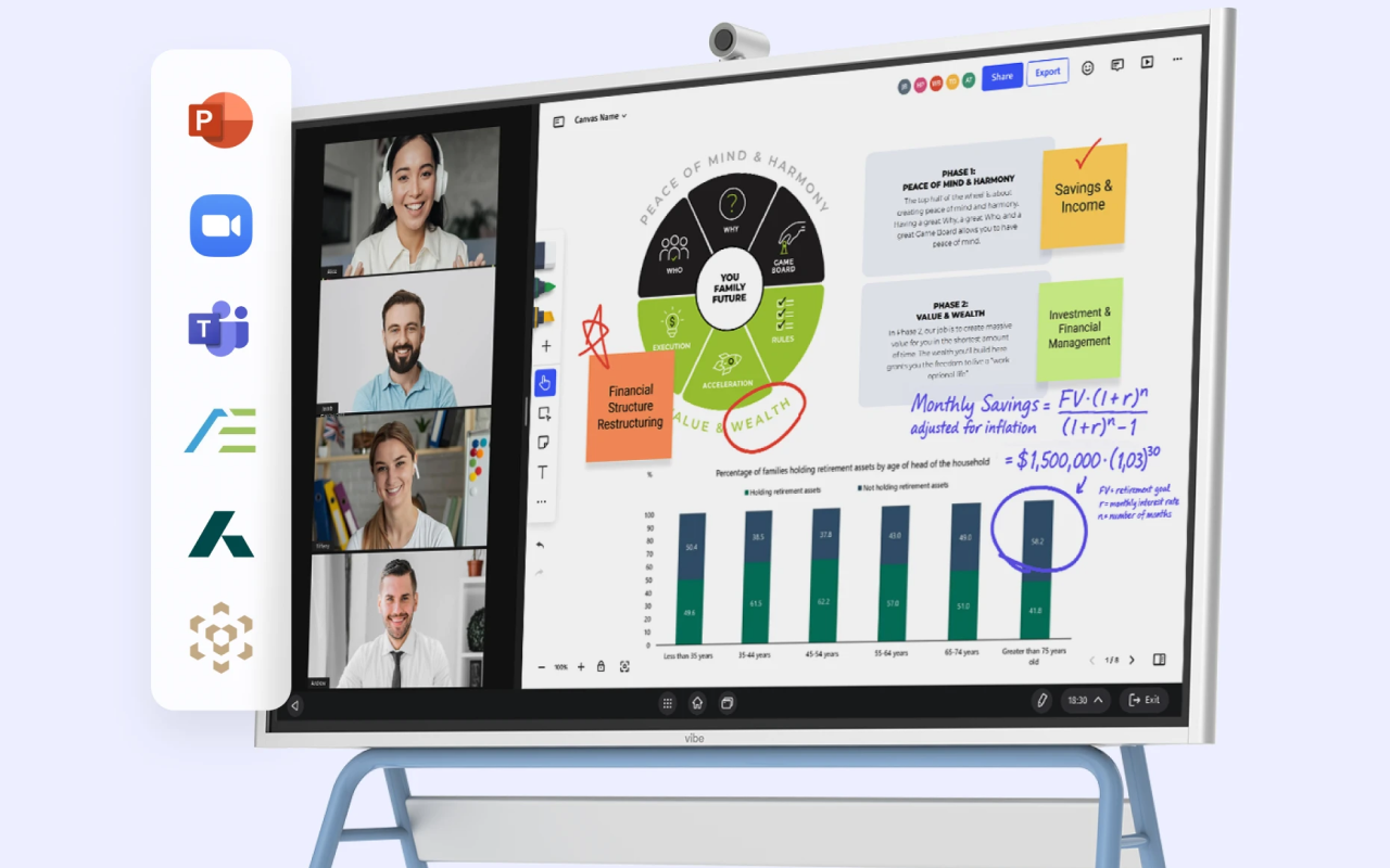
Reviewing and updating OKRs shouldn’t feel like a chore. It should be an engaging, real-time experience that sparks conversation and drives alignment throughout your entire company. That’s where the Vibe Smart Whiteboard comes in. With tools built for brainstorming, presenting, and team collaboration, Vibe makes it easier to hold productive OKR review sessions—whether you’re in the office, working remotely, or holding hybrid meetings. It’s a natural companion for organizations that want to make their OKR dashboards actionable.
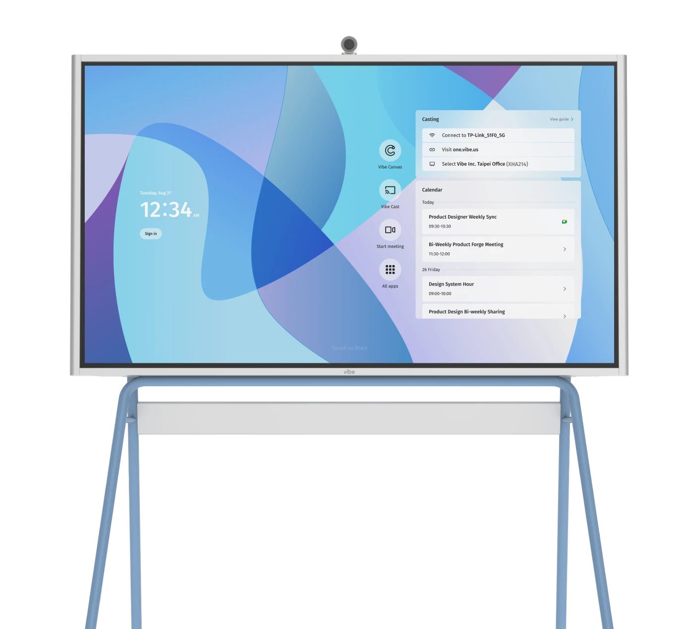
The Vibe Board S1 is built for dynamic, interactive teamwork. It integrates seamlessly with top productivity apps and lets team members annotate, update progress, and contribute ideas no matter where they are. If you’re ready to take your OKR process to the next level, request a demo and see how Vibe can power smarter goal-tracking sessions.
 Team using Vibe Board S1 with OKR dashboard for a more efficient OKR process in a hybrid meeting.
OKR Dashboards FAQs
What is an OKR dashboard?
An OKR dashboard is a visual tool used to track progress on objectives and key results in real time. It helps individuals, teams, and organizations stay aligned by making goals and their measurable outcomes visible and easy to monitor. These dashboards typically include graphs, progress bars, and color-coded status indicators to show how close each key result is to completion.
How do you create an OKR dashboard?
To build an OKR dashboard, start by defining your objectives and determining measurable key results for each one. Next, choose an OKR software platform or dashboard tool that suits your needs. Configure your dashboard to pull in the right data and display it in a clear, visual format using charts, indicators, and status updates. Make sure it updates regularly and is accessible to all relevant team members.
What is the difference between an OKR and a KPI?
OKRs (objectives and key results) are broader goal-setting frameworks that define what you want to achieve and how you’ll measure success. KPIs (key performance indicators), on the other hand, are specific metrics used to evaluate ongoing performance in particular areas. While KPIs can be used within OKRs as key results, not all KPIs are tied to strategic objectives. Think of OKRs as goal-driven and future-focused, while KPIs are more about maintaining and measuring business performance.
What does OKR stand for?
OKR stands for objectives and key results. An objective defines a clear goal or ambition, while the key results are the measurable steps used to determine progress toward that goal. The OKR framework originated in the tech industry but is now widely used across many sectors for strategic planning and performance management.
What software is best for OKR dashboards?
The best OKR dashboard software depends on your organization’s size, structure, and tech stack. For enterprise teams, integrations with analytics platforms and collaboration tools may be essential. Smaller teams might prefer lightweight, visual dashboards that are easy to set up and maintain. The key is choosing a tool that fits your workflow and supports real-time updates and transparency—like you can find with the Vibe board S1.
