
A pyramid chart turns layered data into a shape anyone can read at a glance. Whether you're mapping a company hierarchy, visualizing a sales funnel, or presenting Maslow's Hierarchy of Needs in a strategy session, the pyramid form makes relationships between levels instantly obvious.
But knowing what a pyramid chart is only gets you so far. The more useful questions are: which type fits your data, how do you build one that actually communicates, and where does it belong in your workflow?
This guide covers all of it—definitions, types, real examples, a step-by-step creation process, and the tools that make it faster.
What Is a Pyramid Chart?
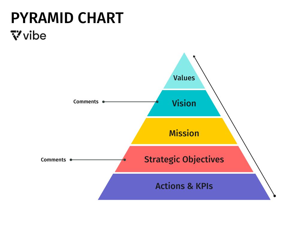
A pyramid chart is a triangular diagram divided into horizontal sections, where each layer represents a category, level, or proportion of a whole. The position of each layer—and sometimes its width—communicates hierarchy, relative size, or sequential order.

The two most common conventions:
-
Bottom-heavy pyramids place the largest or most foundational category at the base, tapering upward toward the smallest or highest-priority item.
-
Inverted pyramids flip this structure, placing the broadest concept at the top and narrowing downward.
Unlike bar charts or pie charts, pyramid charts aren't primarily about precise numerical comparison—they're about showing structural relationships and proportional hierarchy in a format that's easy to present and discuss.
A Brief History: Why Pyramid Charts Work
The pyramid shape has communicated hierarchy and order for centuries, but its modern use as a data visualization tool became widespread in the mid-20th century. The most cited example is Abraham Maslow's 1943 paper A Theory of Human Motivation, published in Psychological Review, which introduced a five-level hierarchy of human needs—later visualized as a pyramid that remains in textbooks and presentations to this day.
The food pyramid, introduced by the USDA in 1992, brought the format into everyday life. Both examples demonstrate why the pyramid endures: layered information with a clear top-to-bottom logic reads faster than a table and is easier to remember than a list.
Types of Pyramid Charts (With Examples)
Not all pyramid charts work the same way. Here are the four main types and the situations where each one belongs.

1. Hierarchical Pyramid Chart
The most common type. Each layer represents a rank or tier, with the highest authority or priority at the top. The width of each section is roughly equal—the point is order, not proportion.
Best for: Organizational charts, management structures, decision-making hierarchies
Example: A corporate org chart with the CEO at the apex, followed by VPs, directors, managers, and individual contributors.
2. Proportional Pyramid Chart
Here, the width of each layer reflects its relative size or volume. A wider section means more—more budget, more people, more market share.
Best for: Sales funnels, population segments, resource allocation
Example: A marketing funnel showing 10,000 leads at the base, narrowing to 2,000 prospects, 500 qualified opportunities, and 100 closed deals at the top.
3. Inverted Pyramid Chart
The widest section sits at the top. Often used to show that the most important or most resourced element is at the peak of the structure.
Best for: Journalism (most important facts first), customer support escalation paths, inverted organizational models
Example: A news article structure—lead with the headline and core facts at the top, supporting details in the middle, background context at the bottom.
4. Symmetrical (Population) Pyramid Chart
Two pyramid charts placed back-to-back horizontally, sharing a center axis. Each side represents a different group or variable.
Best for: Demographic data, before/after comparisons, gender-based breakdowns
Example: A population pyramid showing age distribution for male and female populations in a given region—a standard tool in demography and public health planning.
What Are Pyramid Charts Used For?
Pyramid charts show up across departments and industries because the underlying logic—layered structure, relative proportion, directional flow—applies to a wide range of data. The most common use cases:

Strategic Planning and Prioritization
Leadership teams use pyramid charts to visualize strategic priorities: company vision at the top, followed by annual goals, quarterly objectives, and weekly tasks. The pyramid form makes it visually obvious which level supports which. When used alongside other frameworks—like a SWOT analysis or a pros and cons list—pyramid charts help leadership teams move from open-ended discussion to prioritized structure.
Sales and Marketing Funnels
A proportional pyramid chart is a natural fit for funnel visualization—showing how a large pool of leads narrows through qualification, nurturing, and conversion. It's more intuitive than a table of conversion rates and easier to present to stakeholders.
Organizational Structure
Hierarchy is one of the oldest applications. A pyramid chart communicates reporting structures, span of control, and organizational layers faster than a written description or a flat list of titles.
Training and Education
Pyramid charts are used in training materials to teach frameworks—Bloom's Taxonomy in education, the Risk Pyramid in finance, the Safety Hierarchy in construction. The layered structure helps learners understand how concepts build on each other.
Data Segmentation
When you need to show how a population or dataset breaks into meaningful segments—customer tiers, budget categories, product lines by revenue—a pyramid chart communicates the distribution at a glance.
Benefits of Using a Pyramid Chart
Instant Visual Hierarchy
The human eye reads top-to-bottom and large-to-small naturally. A pyramid chart exploits both instincts simultaneously, making hierarchy legible without labels or explanations.
Simplifies Complex Structures
When a concept has multiple interdependent levels—each one building on or depending on the one below—a pyramid captures that dependency in a single image. No bullet list or table achieves the same compression.
Works in Presentations
Pyramid charts scale well to large displays and are easy to annotate during live discussions. A team can point to a specific layer and discuss it without losing the broader context of the full structure.
Reveals Proportional Imbalances
In a proportional pyramid chart, a layer that's unexpectedly wide or narrow immediately raises a question. That visual anomaly often surfaces insights that a data table would hide.
How to Create a Pyramid Chart: Step by Step
Step 1: Define Your Goal
Before choosing a layout, answer one question: what relationship am I trying to show? Hierarchy (who reports to whom), proportion (how much of each), or sequence (what comes before what)? The answer determines which pyramid type to use.
Step 2: Identify and List Your Layers
Write out every category or level that belongs in your pyramid. Don't worry about order yet—get everything on the table first. For a sales funnel, that might be: awareness, interest, consideration, intent, purchase. For an org chart: executive team, senior leadership, managers, individual contributors.
Step 3: Establish the Hierarchy or Proportion
Decide what determines the order and, for proportional pyramids, the relative size of each layer. Rank categories by volume, authority, importance, or sequential dependency. If you're working with actual data, note the numbers—they'll inform the width of each section.
Step 4: Sketch the Structure
Before finalizing anything, sketch the pyramid roughly—on paper, a whiteboard, or a digital canvas. This low-fidelity draft is where you catch structural problems: layers in the wrong order, missing categories, or a hierarchy that doesn't quite make sense visually.
This is where Vibe Canvas earns its place in the process. Its Smart Shape feature instantly converts a freehand triangle into a clean geometric form, and you can build out the layered sections directly on an infinite canvas—sketching, rearranging, and refining in one workspace without switching tools. If you're working through the structure collaboratively, teammates can contribute from any device in real time. Unlike mind mapping, which explores relationships outward from a central node, a pyramid chart enforces a strict top-to-bottom hierarchy—making it the better choice when rank or proportion is the primary message.
If you're in a meeting room, Vibe Board S1 takes this further—you can sketch and refine your pyramid on a 55″ or 75″ touchscreen display, with everyone in the room able to see and directly interact with the canvas. Remote collaborators stay on the same board through Canvas, so hybrid teams can work through the structure together without any friction.
Step 5: Add Labels, Data, and Visual Styling
With the structure confirmed, add the text labels for each layer, any supporting data or percentages, and visual polish—color-coding tiers, adjusting font sizes for hierarchy, and ensuring sufficient contrast for readability. Keep color use purposeful: use it to reinforce the hierarchy (darker at base, lighter at apex, or vice versa) rather than just for decoration.
Step 6: Present and Refine
A pyramid chart is often most valuable in the moment of discussion, not just as a finished artifact. Present it to your audience, walk through each layer, and be prepared to adjust based on feedback. Vibe Canvas's Presentation View lets you focus on one section of the canvas at a time—useful when you want to walk a stakeholder through each pyramid layer without visual distraction.
If the pyramid is part of a strategic decision—a new org structure, a revised sales process, a prioritization framework—the discussion around it matters as much as the diagram itself. Vibe Bot captures meeting audio and generates summaries of in-room discussions, so the context and decisions made during the session don't get lost after the meeting ends. When the pyramid gets revised two weeks later, you have a record of why each layer was set the way it was.
Common Pyramid Chart Mistakes to Avoid

Too Many Layers
Pyramid charts work best with 3–7 layers. Beyond that, individual sections become too thin to label clearly, and the hierarchy becomes harder to read. If you have more categories, consider grouping related items into a single layer or switching to a different chart type.
Inconsistent Layer Logic
Every layer in your pyramid should follow the same organizational principle. Mixing hierarchy with proportion—some layers representing authority, others representing volume—creates a chart that's visually coherent but conceptually confusing.
Ignoring Proportional Accuracy
In a proportional pyramid chart, if the visual widths don't reflect the actual data, the chart misleads. If your top funnel has 10x the volume of your bottom funnel, the base section should be meaningfully wider—not just slightly so.
Over-labeling
Pyramid charts communicate through shape and position. Long text blocks inside narrow sections undermine both. Keep labels short; use a legend or annotations outside the pyramid for detail.
Pyramid Chart Examples Across Industries

Marketing: The AIDA Funnel
Awareness → Interest → Desire → Action. A proportional pyramid chart visualizes how a broad audience narrows as prospects move through each stage, helping marketing teams identify where they're losing people and where to invest.
Finance: The Investment Risk Pyramid
Base layer: low-risk, liquid assets (cash, bonds). Middle: moderate-risk (index funds, real estate). Apex: high-risk, high-reward (individual stocks, alternatives). This structure guides portfolio allocation conversations with clients.
HR and L&D: Bloom's Taxonomy
Bloom's Taxonomy, first developed by Benjamin Bloom in 1956, organizes cognitive learning objectives into six levels—from Remember at the base to Create at the apex. It's widely used in curriculum design to ensure learning objectives build progressively from recall toward application and synthesis.
Operations: The Safety Hierarchy of Controls
Elimination → Substitution → Engineering Controls → Administrative Controls → PPE. This pyramid is a standard tool in workplace safety planning, showing which controls are most effective (at the base) and which are last resorts (at the top).
Strategy: Maslow's Hierarchy of Needs
Still the most recognized pyramid chart in the world. Physiological needs at the base, self-actualization at the apex. Maslow's original 1943 paper introduced the five-level hierarchy of human needs; the pyramid visualization came later and has since become a fixture in marketing strategy, product design, and organizational culture discussions to frame what motivates people at different stages.
FAQs
What is the difference between a pyramid chart and a funnel chart?
They're closely related. A funnel chart is typically used for process flows where items drop out at each stage (like a sales pipeline), and the shape emphasizes the narrowing. A pyramid chart is broader—it can represent hierarchy, proportion, or sequence, not just process drop-off. The choice often comes down to whether you're showing a flow (funnel) or a structure (pyramid).
When should I not use a pyramid chart?
Avoid pyramid charts when your data doesn't have a natural hierarchical or proportional structure, when you need to show precise numerical comparisons (a bar chart is more accurate), or when your audience needs to extract specific values rather than understand relative relationships.
How many layers should a pyramid chart have?
Three to seven layers is the practical range. Three layers is the minimum to establish a meaningful hierarchy. Beyond seven, labels become unreadable and the structure loses clarity. If you have more distinct categories, consider grouping or using a different visualization.
Can I create a pyramid chart in PowerPoint or Google Slides?
Yes—both tools have SmartArt or shape-based options for basic pyramid diagrams. For more flexibility, especially if you're building the chart collaboratively or iterating on it during a live session, a tool like Vibe Canvas gives you an infinite canvas with Smart Shape recognition that converts your sketches into clean geometric forms automatically.
What's the best tool for creating a pyramid chart for team presentations?
If you're building a pyramid chart to present in a team meeting, the ideal workflow keeps creation and presentation in one place. Vibe Canvas lets you build the diagram and present directly from the same canvas—with Presentation View to focus on specific layers—whether your team is in the room or joining remotely.
How is a pyramid chart different from other visual frameworks like mind maps or concept maps?
Each tool serves a different thinking mode. A mind map radiates outward from a central topic and is best for brainstorming and exploring connections. A concept map shows relationships between ideas in a non-linear web. A pyramid chart enforces a strict vertical hierarchy or proportional structure—making it the right choice when rank, size, or sequential dependency is the core message, rather than association or exploration.