

In an era of shrinking attention spans, visuals grab attention fast, clarify meaning at a glance, and drive action when moments are brief or stakes are high. If a picture is worth a thousand words, visual communication is one of the most powerful ways to convey meaning. Visual communication uses images, icons, and graphics to share messages clearly and quickly—in less time than it takes to read text. It brings together two related disciplines: communication design, which focuses on crafting messages that educate, motivate, and engage, and graphic design, which applies visual principles to present those messages in a clear, attractive, and impactful way.
Our brains are wired to respond to visuals. In fact, we process images 60,000 times faster than text, and it takes just 13 milliseconds to understand a picture—no wonder 90% of the information transmitted to the brain is visual. This natural advantage makes visuals more memorable and impactful, especially when paired with written messaging. The key is choosing the right visual for the right message. Read on to learn more about visual communication and how to get started creating powerful messaging.
- Visual communication uses images and graphics to convey messages more efficiently than words alone.
- It’s distinct from graphic design and communication design in its purpose and focus.
- The human brain processes visuals dramatically faster than text—in as little as 13 milliseconds.
- Visuals like charts, symbols, and infographics help simplify complex information.
- Effective visual communication enhances engagement, understanding, and memory.
Why Visual Communication Works
In a world overflowing with information, getting your message across clearly and quickly is more important than ever. Visuals help cut through the noise, making ideas easier to understand, remember, and connect with on a deeper level.
Faster Information Processing
Visual communication is effective because of how fast the human brain can understand and process visual content. People can see a picture, chart, or diagram and instantly comprehend the message, and this speed also improves both comprehension and recall—so your viewers can absorb and retain information more efficiently.
Improved Comprehension and Retention
In addition, when data or ideas are presented visually—such as through a chart, diagram, or illustration—it’s easier to see patterns, relationships, and meaning at a glance. This is especially helpful in situations where time is limited or you have limited space to fit your message, like a billboard or in a quick social media reel.
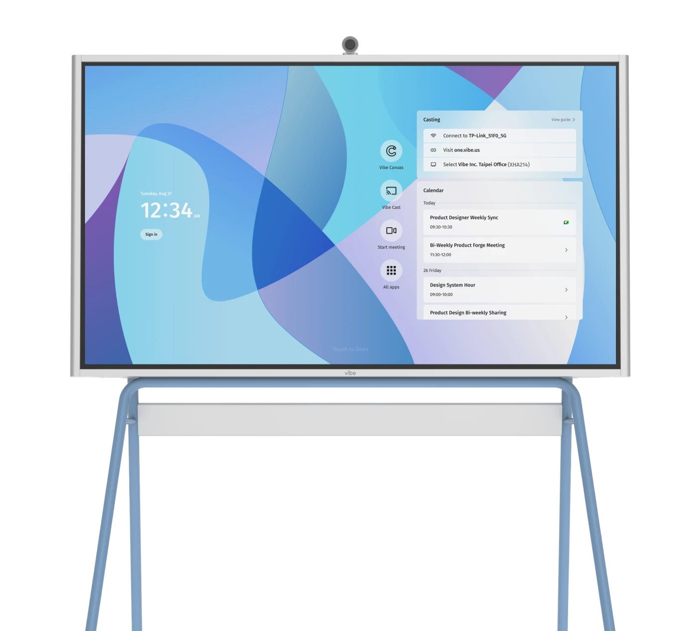
 Utilizing a Vibe Board enhances the clarity and intuitiveness of information presentation.
Complex Problems Simplified
Visuals also break down complex ideas into something simple that’s easier to understand and digest. Rather than overwhelming people with long explanations or technical jargon, visual communication breaks information down into manageable pieces. Infographics, for example, can combine numbers, icons, and brief text to walk someone through a multi-step process or explain a dense topic.
Deeper Emotional Engagement
At the same time, visuals can tap into human emotions that make the message more engaging and memorable. Whether you’re presenting data, teaching a concept, building a brand new website, publishing company content, or telling a story, the right visual can make your message stick.
Visual communication is particularly effective in instances where you need to:
-
Explain complex technical processes to non-technical audiences.
-
Present data insights in ways that will drive decision-making.
-
Train employees on policies and procedures quickly.
-
Communicate more effectively across language barriers.
-
Retain attention in crowded digital environments.
Key Elements of Visual Communication
Effective visual communication begins with a clear purpose: making meaning obvious at a glance, directing attention in a sensible order, and making the next step feel effortless. When messages are shaped thoughtfully and presented with intention, visuals do more than decorate—they reduce cognitive load, surface what matters first, and help ideas stick.
Here are the key elements that make visual communication effective:
-
Clarity. Strip away noise and distill the core idea so meaning is obvious at a glance.
-
Visual hierarchy. Use size, weight, position, and spacing to guide what’s seen first, next, and last.
-
Contrast and emphasis. Create deliberate differences (color, scale, weight) to make critical points stand out.
-
Consistency. Apply repeatable styles and patterns to build recognition, trust, and faster comprehension.
-
Accessibility and universality. Ensure legibility, sufficient contrast, and recognizable symbols to work across abilities and cultures.
Visual Components
These are a few of the main visual components that can bring your communication to life:
-
Images. Photos, illustrations, and videos add an emotional touch and visual clarity. They can tell a story or set a tone instantly.
-
Graphics. Infographics, charts, and diagrams help explain data, relationships, and processes in a visually digestible way.
-
Typography. The size, style, and arrangement of text influence the readability and how the viewer’s eye moves through the content.
-
Iconography. Simple, recognizable symbols that speed recognition and reduce reading load.
-
Color. Color creates emotions and strengthens brand consistency. For instance, yellow draws attention, while green implies growth or safety. Adding your company colors throughout all of your content helps brand all your visuals.
-
Layout. Grids, spacing, and reusable patterns that create alignment, rhythm, and clear paths through content.
💡Pro Tip: To get started, consider:
-
Is the primary message the most prominent element (size/weight/position)?
-
Can the core takeaway be grasped in 3 seconds or less?
-
Does the layout guide the eye in a clear path (start → support → action)?
-
Are styles consistent with sufficient contrast (3 or fewer core colors, readable type)?
-
Is the next step unmistakable and placed where attention naturally ends?

Types of Visual Communication
Visual communication can involve a wide variety of different ways to shape your content. These are some of the most common type of visual communication to consider.
Static Visuals
Static visuals are non-moving images that present information in a clear, fixed format. Common examples include posters, infographics, charts, diagrams, and photographs. These visuals are especially effective for conveying key messages at a glance, summarizing data, or providing instructions.
Because they don’t require interaction or motion, they’re easy to consume in both print and digital formats. Static visuals are great for reinforcing brand identity and simplifying complex topics. Their simplicity makes them highly shareable and suitable for everything from educational handouts to social media graphics.
Motion Visuals
Motion visuals use movement, often through video, animation, or motion graphics. These formats are particularly powerful for storytelling or for demonstrating step-by-step processes in detail. By combining visuals with audio and timing, motion visuals engage multiple senses. For example, a short animated explainer can simplify a complicated idea in just a few seconds. Motion visuals are widely used because of their dynamic nature that makes them memorable and versatile.
Interactive Visuals
Interactive visuals invite users to engage directly with the content. This includes websites, dashboards, infographics with clickable elements, mobile apps, and product configurators. Unlike static or motion visuals, interactive formats adapt to user input and help create a personalized and immersive experiences. For example, an interactive data dashboard lets users filter, sort, and analyze insights on demand. These visuals are particularly useful for complex or data-rich subjects where exploration leads to understanding.
|
Type |
Best For |
Popular Formats |
Popular Tools |
|
Static visuals |
At‑a‑glance messaging, data snapshots, instructions, brand reinforcement, print/digital assets |
Posters, infographics, charts, diagrams, social graphics, photographs |
Adobe Illustrator, Canva, Affinity Designer |
|
Motion visuals |
Storytelling, step‑by‑step demos, product explainers, ads, social video |
Video, animations, motion graphics, reels/shorts |
Adobe After Effects or Premiere Pro, CapCut |
|
Interactive visuals |
Exploration of complex/data‑rich topics, personalization, product configuration, dashboards |
Interactive infographics, web pages, dashboards, apps, product configurators |
Figma, Tableau, Vibe Canvas |
💡Pro Tip: Choosing a visual format:
-
If time is tight, use static; if depth is needed, use interactive.
-
If the audience scrolls fast, use motion; if they’re seated and focused, use static.
-
If the content is complex or data‑rich, use interactive; if it’s simple, use static.
-
If budget/resources are limited, choose static; if you can invest more, consider motion or interactive.
-
Match the format to the channel’s strengths and audience expectations (e.g., reels for social, slides for meetings, dashboards for analysis).
Common Visual Communication Pitfalls
Even strong ideas can fall flat if the visuals get in the way of understanding. The most common issues stem from designing before clarifying the message, overloading the canvas, or overlooking how people actually scan and interpret information. Addressing a few high-impact pitfalls will dramatically improve clarity, credibility, and action.
Cluttered layouts and inconsistent branding
Crowded designs, mismatched styles, and noisy color choices make it hard to see what matters. Simplify the layout, prioritize one clear takeaway, and use a consistent system for color, typography, and spacing so the most important point stands out first.
Poor accessibility and low contrast
Tiny type, low-contrast palettes, and color-only cues reduce readability—especially on mobile and for users with visual impairments. Use sufficient contrast, pair color with labels or patterns, write meaningful alt text, and test at smaller sizes to ensure everyone can understand the message.
Missing context and unclear headlines
Visuals without a clear title, brief annotations, or source notes are easy to misinterpret, and culturally insensitive imagery can alienate audiences. Lead with a headline that states the takeaway, add concise callouts where attention is needed, cite sources when relevant, and sanity-check imagery for cultural fit.
Blurry files and slow-loading assets
Wrong formats, low resolution, or heavy files undermine professionalism and hurt performance. Export for the target platform with proper dimensions and compression, use vector formats when possible for crispness, and optimize media so it loads quickly without sacrificing clarity.
Mismatch between format and audience
Using the wrong visual style or complexity can confuse or lose viewers. Choose static for quick scanning, motion for storytelling and demos, and interactive for data exploration—then align tone and fidelity with the audience’s expectations and the channel where it will appear.
Enhancing Visual Communication with the Right Tools
Visual communication makes ideas easier to understand, remember, and act on. From simplifying complex data to engaging emotions and guiding decisions, it’s one of the most effective ways to share information. But crafting clear, compelling visuals doesn’t happen by accident. It takes the right tools to bring those ideas to life. That’s where Vibe smart whiteboards shine.
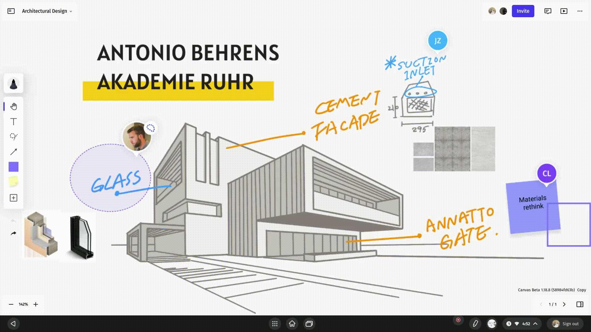
Easily turn complex thinking into clear diagrams, storyboards, and data views that everyone can grasp at a glance with the Vibe Board S1. Its seamless real-time collaboration features keep meetings active rather than passive, whether participants are in the room or remote, so energy stays high and alignment comes faster. When the session ends, everything saves and shares cleanly to the cloud—boards, snapshots, and action items—so momentum carries into execution.
Vibe also connects seamlessly with 250+ popular apps—including the popular visual communication tools above— allowing you to pull in files from design tools, data from dashboards, and assets from your content stack—so teams can collaborate without breaking their workflow.
Whether you’re facilitating design thinking sessions, delivering data-driven client presentations, or teaching complex concepts, Vibe provides the digital canvas and collaborative tools to make your visual communication more dynamic and effective. By integrating Vibe into your workflow, you can make your visual communication sharper, more inclusive, and more productive.
Ready to see how it works? Request a demo today and experience the power of visual communication in action.
 Team using a Vibe Board for visual communication to share and empower ideas.
Visual Communication FAQs
What is visual communication and what are some examples?
Visual communication is the practice of conveying ideas and information through images, symbols, and other visual elements. It helps people understand content quickly and often more clearly than with words alone. Common examples include infographics that summarize data, charts that visualize trends, icons that represent actions or tools, photographs that provide context, and videos that tell stories or explain processes. These visuals are used everywhere—from business presentations to social media posts and classroom materials. By translating complex ideas into visual formats, visual communication improves clarity and engagement.
Why is visual communication important?
Visual communication is important because it accelerates understanding and makes information more memorable. Our brains are hardwired to process visuals faster than text, which means audiences can absorb key points quickly. It also enhances engagement, helping content stand out in busy environments where attention spans are short. Compared to plain text, visuals evoke emotion, simplify complexity, and create stronger connections with viewers.
What are the 4 main types of visual communication?
The four main types of visual communication are:
-
Static visuals. These include still images like posters, charts, infographics, and diagrams that present fixed information clearly and concisely.
-
Motion visuals. These involve movement, such as videos, animations, and motion graphics, and are ideal for storytelling or explaining dynamic processes.
-
Interactive visuals. Dashboards, websites, and mobile apps let users engage with content directly, often exploring information at their own pace.
-
Symbols and signs. Icons, maps, and wayfinding signs use universally understood visuals to communicate quickly and across language barriers.
Is visual communication considered a skill?
Yes, visual communication is a valuable and teachable skill. It involves selecting, organizing, and presenting visual elements to effectively deliver a message. This includes knowing how to use design principles like layout, hierarchy, and color to guide attention and improve clarity. It’s a skill that’s useful across many fields, including marketing, education, journalism, user experience (UX), and business strategy.
What makes a good visual communication design?
A good visual communication design is clear and consistent. It uses visual hierarchy to prioritize information and guide the viewer’s eye from the most important points to the supporting details. Effective designs also make smart use of color, layout, and typography to enhance readability and draw attention. Consistency in style and branding helps build trust and makes content feel cohesive.