There are a million reasons why people need to create PowerPoints, but not everyone knows how to make the most of the software. You’re not mediocre and bland (obviously, because you’re reading this post), so don’t let your presentation go down that route. From layout to design to presenting, we have the inside scoop on how to use PowerPoint to create a showstopper presentation.
How to structure a PowerPoint
Our society pays billions to be entertained with stories — whether through movies, TV, news, books, or radio. Your presentation topic may not be the most entertaining, but regardless of how dry the material is, you’re telling a story. Keep the audience engaged from start to finish with a solid presentation layout.
But let’s be clear here. Though structure is essential, not every presentation needs to have the same structure. For example, maybe you want to introduce yourself after your hook to make sure you have the audience’s attention. You can then support why you care about the topic by sharing your relevant expertise. To make things simple, we’ve created a basic structure to guide your presentation.
Know your purpose
Before you start preparing, ask yourself, "What is the purpose of this presentation?" Are you trying to inform, inspire, entertain, or persuade? Maybe you have more than one purpose. Whatever your reason is for addressing an audience, let that purpose guide your decisions for the presentation’s structure.
Introduce yourself
What you choose to share with the audience about yourself depends on the setting and your purpose. But, to instill trust and help the audience see you as more than just a warm body, you should always state your name and relevant professional background.
Start with a hook
A study by Prezi found that 55% of people say a great story keeps them focused and engaged during a presentation. Grab your audience with a riveting story, a noteworthy fact, a stunning visual, or an inspiring quote. Include something that piques their interest and makes them want to listen to you.
Lay it out
Tell them what you’re going to tell them. Give the audience a brief glance at what will be covered during the presentation. This could be one slide with a few keywords or visuals.
Flow through the body
The body of your presentation should be divided logically. This could be done chronologically, by priority level, or by stating problems followed by solutions. Ensure that all claims are supported with data and facts, but keep each slide concise (more on that to come).
Review the basics
Once you’ve stated all the essential parts of your presentation, briefly summarize what you just shared. Connect all the pieces together and help the audience understand the importance of what they learned.
Call them to action
Remember the purpose you determined? Choose a call to action that matches your purpose. Extend an invitation for the audience to do something — to make a change, to believe something new, or to make a purchase. If possible, revisit the hook. People have an easier time retaining information if they reconnect to the beginning.
Q&A
This may not apply to every presentation, but leave time for questions from the audience. You may also choose to invite the audience to ask questions throughout the presentation to make it more of a discussion and keep them engaged.
Designing PowerPoint slides
Just as your appearance and body language send a clear message to the audience, poorly designed slides can distract, detract, and destroy the professionalism of a presentation. Before you start throwing around words and images in PowerPoint, be careful to follow these essential design principles.
Choose a simple slide background
How do you choose from PowerPoint’s wide range of templates? Keep it simple. Choose a light background and dark text to make your content easier to read. But don’t feel obligated to stick to the program’s templates. You can create a professional-looking presentation with a white background and carefully selected fonts.
Use a reader-friendly font
Remember, when it comes to choosing a font, go for readability. Though decorative fonts are acceptable for titles, avoid using them for body copy. Instead, opt for a sans-serif font to keep things looking clean. If you’re using a font not typically found in PowerPoint or another presentation program, make sure to embed the font files. Try not to use more than two fonts in your presentation.
Limit text with the 6 x 6 rule
Too much text is overwhelming for an audience. Keep your text to a bare minimum to help them stay focused. An easy way to do this is with the 6 x 6 rule. Have no more than six lines of text on a slide, each with only 6 words.
Match the color scheme to the purpose
Again, every decision should tie back to your purpose — including color scheme. Colors can inspire different moods and impressions. Are you giving a presentation for a specific organization? Incorporate the brand’s colors into your design. Are you trying to sell something? Maybe include shades of green to encourage growth and money usage.
Only use high-quality photos
Nobody wants to look at a blurry, pixelated photo. Only choose high-resolution photos for your presentation. Also, make sure that any image you include has a reason for being used. Images can be distracting if they don’t have a purpose.
Don’t center align
Our eyes work harder to see where the line begins when text is center-aligned. Instead, make text left-aligned, or even right-aligned, to feed the mind’s craving for clean, sharp alignment. Everything on your slide, including titles and images, should be aligned to an invisible line.
Keep it consistent
Once you’ve selected your slide template, fonts, and color scheme, these design elements should stay the same throughout the presentation. This repetition helps the audience stay focused on the main point of the presentation and keeps your presentation looking professional.
 Two coworkers review how to make a PowerPoint for their next big presentation.
Tips for creating an engaging presentation
-
Craft thoughts before slides. Know what you want to say before you create your presentation. Your slides should then guide the audience as you tell a story. Keep this more of an outline rather than a word-for-word script. Not only will you sound more conversational, but you’ll have an easier time memorizing the flow of your presentation.
-
Don’t read off the slides. Please — your slides are not a script. The slides are for your audience, not for you. Your goal is to give an engaging presentation, not put the audience to sleep by reading them an essay. Even if you memorized every word of your presentation (which isn’t necessary), avoid sounding rehearsed by speaking as though you’re having a conversation to avoid sounding rehearsed.
-
Adapt to the audience. You may have several different groups that you deliver the same general message to, but that doesn’t mean your presentation should stay the same. The same tone, humor, and anecdotes may not apply to every audience. Know who your audience is before each presentation to tailor your message to their needs.
-
Read body language. On the same note, be sure to scan the audience as you present. Read their body language to learn if they’re losing interest, then use these visual cues to adapt your presentation. Maybe you need more discussion, humor, or simpler language.
-
Be as professional as your presentation. Whether you’re giving an in-person or virtual presentation, you are the main feature of the presentation. The way you dress, your body language, how polished your speech is (avoiding filler words), and your background all send a message to the audience.
Key features in Microsoft PowerPoint
PowerPoint is full of helpful tools to simplify slide creation and give your presentation a cutting edge. But there’s more to PowerPoint than fun sound effects and slide transitions. Here are some unique PowerPoint features to use for your next slideshow.
-
Use a template to save time. Quickly align text and images where you want them with a PowerPoint template. Regardless of the design you decide to go with, each template has built-in text boxes and placeholders that you can easily customize.
-
Get more done with Slide Master. PowerPoint users have the option to use a master slide to keep things like layout and design consistent throughout the presentation. Any edit you make to this slide will automatically appear on all the connected slides. Use this feature by going to the View tab and then selecting Slide Master.
-
See the whole picture with Slide Sorter. Whether you’re practicing transitions or need to rearrange your slides, Slide Sorter gives you a birds-eye view of the whole presentation. This is a great tool to ensure your story has the proper order and flow.
-
Make your tables sparkle. Those data tables are a great way to illustrate a point — but they can also look untidy. Clean up your tables with Distribute Rows. Simply highlight the rows you want to fix, go to the Layout tab, and select Distribute Rows. Like magic, those rows will be evenly distributed.
-
Cut out extra design programs. The Adobe Suite and other design software are great for creating unique graphics to place in your presentation. But when time and resources are limited, you can make eye-catching diagrams straight from PowerPoint using SmartArt. This innovative tool gives you the option to illustrate a process, hierarchy, cycle, or more. Just type out a bulleted list and allow SmartArt to transform the list into a customized diagram.
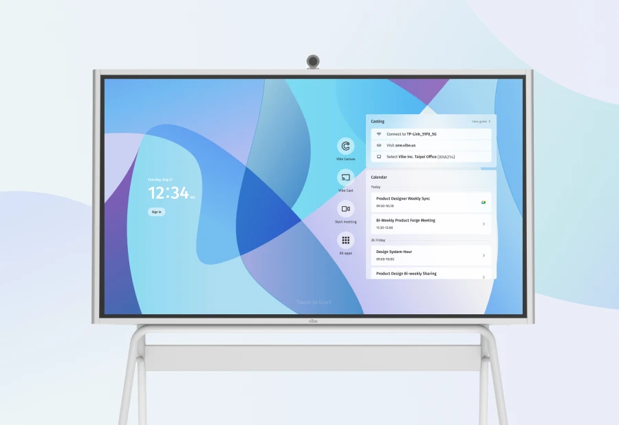
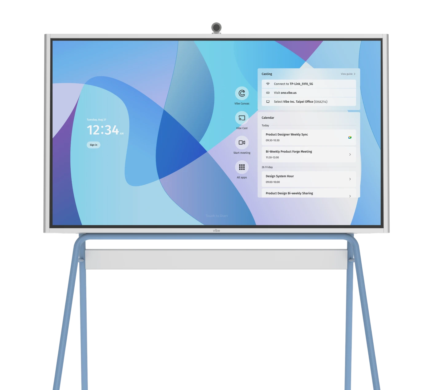
How to give presentations with Vibe
Whether your audience is in the same room or remotely connected, Vibe has the tools you need to give better presentations. Here are some of Vibe’s helpful features:
-
Easy access to PowerPoint. You can open the presentation straight from the PowerPoint app, a digital storage drive (like Google Drive), screencast the presentation from another device, or connect to a computer using an HDMI cable.
-
Point and annotate. Make your presentation an interactive visual experience with features like Vibe’s laser pointer and annotation tool.
-
Navigation at your fingertips. Smoothly transition through the slides by using your finger or the Vibe pen to navigate.
-
Split-screen mode. Go into split-screen mode to keep the presentation on the screen while accessing another app like YouTube.
-
Present to a remote audience. Vibe is integrated with multiple video conferencing apps so you can deliver a showstopper presentation remotely.
-
Collaborate with a global team. Anyone can create a free Vibe Canvas account to work with a remote team and let the ideas flow.
PowerPoint is just one of over 100 apps integrated with Vibe. Check out a free demo to learn how your team can present, meet, and collaborate using Vibe’s innovative tools.
Vibe offers a collaborative solution combining an interactive digital whiteboard and innovative smart software. Increase engagement and efficiency at your brainstorming sessions, virtual training, and classroom sessions by integrating your favorite applications with video conferencing and an infinite, mess-free writing canvas. Collaborate today with Vibe.
Looking for the latest in interactive whiteboard technology? Check out Vibe today!


