

Picture this: You’re in a Monday morning strategy meeting, and your CEO asks, "How are we tracking against our quarterly targets?" Instead of scrambling through spreadsheets or waiting for IT to pull reports, you simply glance at your screen and have the answer instantly. This isn’t wishful thinking—it’s the reality for businesses using KPI dashboards.
Key Performance Indicators (KPIs) are quantifiable measurements that demonstrate how effectively a company is achieving key business objectives. They serve as your business compass, pointing you toward success by tracking everything from revenue growth to customer satisfaction. Without KPIs, you’re essentially flying blind, making decisions based on gut feelings rather than data-driven insights.
But here’s where many businesses struggle: having KPIs is one thing, but making them actionable and accessible is another entirely. That’s where KPI dashboards transform raw numbers into visual stories that drive smarter decision-making across your organization.
- KPI dashboards consolidate critical business metrics into visual displays that enable instant decision-making and eliminate time-consuming data gathering.
- Different dashboard types serve specific purposes—executive dashboards focus on high-level strategy while operational dashboards monitor real-time performance.
- Industry-specific KPI dashboards track unique metrics, from SaaS monthly recurring revenue to manufacturing efficiency rates.
- Successful KPI dashboard implementation requires clear goal definition, proper data integration, and adherence to design principles that prioritize clarity and accessibility.
- Interactive display technology enhances collaborative decision making by allowing teams to manipulate data visualizations in real-time during meetings.
What is a KPI Dashboard?
A KPI dashboard is a visual tool that consolidates key performance indicators from multiple data sources into interactive charts and graphs, allowing for quick, organized review and analysis. Think of it as your business control center—similar to how a car dashboard displays speed, fuel level, and engine temperature at a glance, a KPI dashboard presents your most critical business metrics in an easily digestible format. These powerful tools unite data sources and provide at-a-glance visual feedback showing how your business is performing against strategic objectives. Modern KPI dashboards go beyond static reports by offering real-time updates, interactive elements, and the ability to drill down into specific data points for deeper insights.
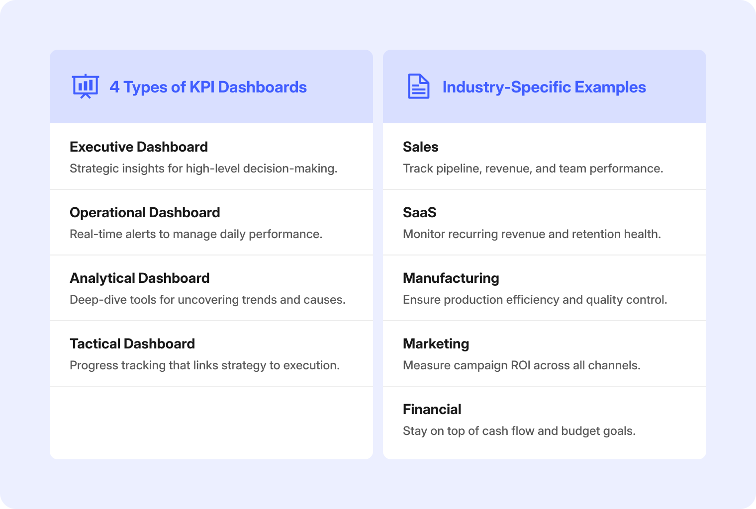
Types of KPI Dashboards
Various types of KPI dashboards serve different purposes across organizations, each tailored to specific user needs and decision-making requirements. Understanding these distinctions helps you choose the right dashboard type for your team’s objectives and ensures maximum impact from your data visualization efforts.
-
Executive Dashboards: If you’re a CEO, CFO, or board member, this is your command center. Executive dashboards cut through the noise to deliver strategic insights like revenue growth trajectories, market positioning, and profitability trends that help you steer the ship confidently and communicate performance to stakeholders with authority.
-
Operational Dashboards: If you’re a department manager, team lead, or operations director, you live and breathe real-time performance. Operational dashboards serve as your early warning system and problem-solving toolkit, alerting you immediately when something goes sideways and providing the specific data you need to fix issues before they escalate.
-
Analytical Dashboards: If you’re a data analyst, business intelligence specialist, or research manager, you need tools that match your analytical depth. Analytical dashboards are built for deep-dive investigations that uncover the "why" behind performance trends, supporting rigorous analysis with complex filtering, benchmarking, and historical comparisons that transform raw data into actionable business intelligence.
-
Tactical Dashboards: If you’re a project manager, department head, or campaign lead, you’re the bridge between big-picture strategy and daily execution. Tactical dashboards track medium-term goals and team performance, providing the perfect balance of strategic oversight and operational detail to keep projects on track while keeping leadership informed of progress toward key objectives.
Benefits of Tracking KPIs With a Dashboard
Adopting KPI dashboards transforms how organizations monitor performance and make decisions, delivering measurable improvements across multiple business functions. These powerful tools eliminate manual reporting bottlenecks while providing unprecedented visibility into business operations.
-
Clear Actionable Insights
KPI dashboards consolidate complex data from multiple sources and present it in clear, visual summaries that make it easy for teams to spot patterns and anomalies immediately. This instant access to meaningful insights enables faster, more confident decision-making at every organizational level. -
Improved Alignment and Accountability
KPI dashboards provide a transparent, real-time view of progress against targets, ensuring all stakeholders remain focused on the same strategic goals. This visibility creates natural accountability as team performance becomes clearly measurable and trackable across departments. -
Higher Productivity and Efficiency
By automating data collection and visualization, KPI dashboards eliminate the time-consuming manual processes that traditionally bog down reporting workflows. This efficiency gain frees up valuable resources so employees can focus on analysis and action rather than data compilation.
Industry Specific KPI Dashboard Examples
Different industries leverage KPI dashboards to track unique metrics that align with their specific business models and operational challenges. Understanding how various sectors apply dashboard technology provides valuable insights for implementing similar solutions in your organization.
Sales KPI Dashboard
Sales KPI dashboards provide comprehensive visibility into revenue performance, pipeline health, client engagement, and team productivity across all sales activities. These centralized tools enable sales managers to monitor performance metrics in real-time, identify successful strategies, and address bottlenecks quickly for improved revenue outcomes.
Key Metrics to Track:
-
Total sales revenue
-
Conversion rates
-
Average deal size
-
Client engagement levels
-
Sales cycle length
-
Individual rep performance
Sales leaders use these insights to forecast accurately, optimize territory management, and provide targeted coaching that drives consistent revenue growth across their teams.

SaaS KPI Dashboard
SaaS companies require specialized dashboards to monitor subscription-specific metrics that differ significantly from traditional business models. These dashboards focus on metrics that directly impact long-term business viability and customer retention in the subscription economy.
Key Metrics to Track:
-
Monthly Recurring Revenue (MRR)
-
Customer churn rates
-
Customer Lifetime Value (CLV)
-
User activation rates
-
Net Promoter Score (NPS)
-
Feature adoption rates
These dashboards help SaaS leaders understand customer behavior patterns, identify expansion opportunities, and make data-driven decisions about product development and customer success initiatives.
Manufacturing KPI Dashboard
Manufacturing operations depend on real-time monitoring of production efficiency, quality control, and resource utilization to maintain competitive advantage. These dashboards provide plant managers with the visibility needed to optimize processes and minimize operational waste.

Key Metrics to Track:
-
Overall Equipment Effectiveness (OEE)
-
Production output rates
-
Defect rates
-
Machine downtime
-
Inventory turnover
-
Safety incident rates
Manufacturing dashboards enable proactive maintenance scheduling, production optimization, and consistent quality standards across all manufacturing operations.
Marketing KPI Dashboard
Marketing teams utilize specialized dashboards to measure campaign effectiveness across multiple channels and optimize resource allocation for maximum ROI. These platforms consolidate data from various marketing tools to provide comprehensive performance visibility.
Key Metrics to Track:
-
Lead generation numbers
-
Conversion rates by channel
-
Cost per acquisition (CPA)
-
Website traffic and engagement
-
Social media performance
-
Marketing qualified leads (MQLs)
Marketing professionals rely on these insights to identify high-performing channels, adjust campaign strategies, and demonstrate clear attribution between marketing activities and revenue outcomes.
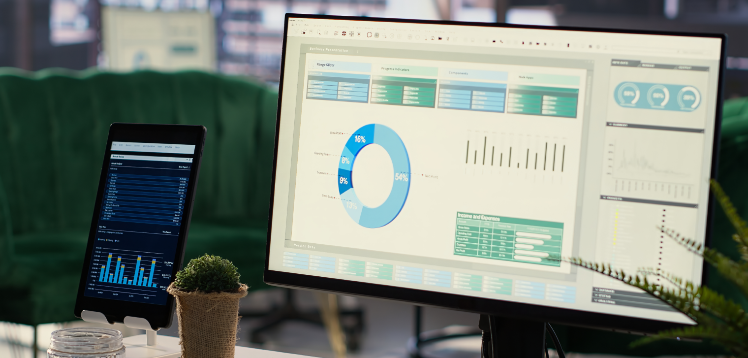
Financial KPI Dashboard
Financial dashboards provide comprehensive oversight of organizational fiscal health through critical financial metrics and performance indicators. These tools support CFOs and finance teams in monitoring spending patterns and ensuring compliance with financial targets.
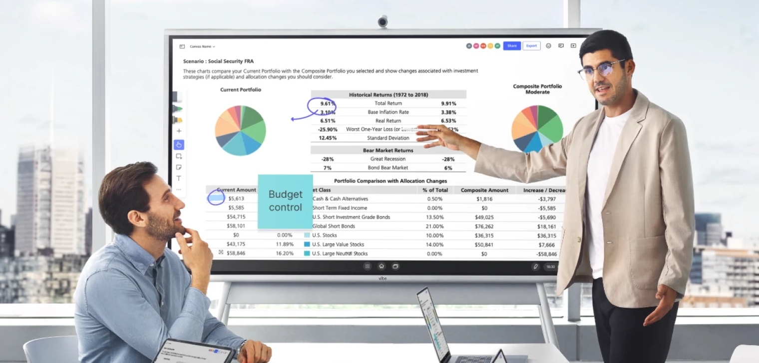 Man using a Vibe Board for portfolio comparison and budget control during a financial team meeting.
Key Metrics to Track:
-
Profit margins by product/service
-
Cash flow projections
-
Operational expenses
-
Budget variance analysis
-
Accounts receivable aging
-
Return on investment (ROI)
Financial dashboards support strategic planning through historical trend analysis and forecasting capabilities that inform investment decisions and resource allocation strategies.
8 Steps to Creating a KPI Dashboard
Building your first KPI dashboard doesn’t have to be overwhelming when you follow a structured approach. These actionable steps will guide you through the entire process, from initial planning to successful deployment.
Step 1: Define Your Business Goals and KPIs
Start by identifying the specific business objectives your dashboard needs to support, then select 5-10 KPIs that directly measure progress toward those goals. This foundation step is crucial because dashboards without clear purpose quickly become cluttered and ineffective. Involve key stakeholders in this process to ensure the selected metrics truly reflect what matters most to decision-makers and align with your organization’s strategic priorities.
Step 2: Map Out Your Data Sources
Map out all the systems, databases, and tools that contain the data needed for your selected KPIs, ensuring you have reliable access to accurate, up-to-date information. This step prevents future frustration by confirming data availability and quality before you begin building visualizations. Document any data integration challenges early so you can address them proactively rather than discovering limitations after investing time in dashboard design.
Step 3: Choose the Right Dashboard Platform
Select a dashboard tool that integrates seamlessly with your existing data sources while offering the visualization capabilities and user experience your team needs. Consider factors like ease of use, scalability, mobile accessibility, and total cost of ownership when evaluating options. The right platform should empower your team to create and modify dashboards without requiring extensive technical expertise or ongoing IT support.
Step 4: Plan Your Layout Before You Build
Create a logical, intuitive layout that prioritizes your most important KPIs and follows natural eye-scanning patterns for maximum usability. Position critical metrics in the top-left area where users naturally look first, and group related information together to tell a coherent data story. Sketch your layout before building to ensure the design supports quick decision-making rather than forcing users to hunt for key information.

Step 5: Connect, Integrate, and Automate Your Data
Establish automated connections between your data sources and dashboard platform to ensure metrics update regularly without manual intervention. Set up appropriate refresh schedules based on how frequently your data changes and how current your team needs the information to be. Test all data connections thoroughly to verify accuracy and establish monitoring processes to catch any integration issues quickly.
Step 6: Customize Visualizations and Metrics
Tailor your charts, graphs, and visual elements to your audience’s preferences while ensuring each visualization clearly communicates its intended message. Choose chart types that best represent your data—line graphs for trends, bar charts for comparisons, and gauges for progress tracking. Apply consistent color schemes and formatting throughout the dashboard to create a professional, cohesive appearance that enhances rather than distracts from the data.
Step 7: Test, Review, and Refine
Conduct thorough testing with actual users to identify usability issues, verify data accuracy, and gather feedback on the dashboard’s effectiveness. This validation step often reveals gaps between intended design and real-world usage patterns that need addressing. Schedule regular review sessions to ensure the dashboard continues meeting user needs as business requirements evolve and new data sources become available.
Step 8: Roll It Out and Regularly Maintain
Deploy your dashboard to key stakeholders and establish processes for ongoing maintenance, user training, and performance monitoring. Track how frequently different sections are viewed to understand which metrics provide the most value and which might need adjustment. Create user guides and provide training sessions to ensure team members can fully leverage the dashboard’s capabilities for improved decision-making.
KPI Dashboard Design Principles
Successful KPI dashboard design requires adherence to proven principles that prioritize user experience and data clarity over flashy visuals. These fundamental guidelines ensure your dashboard delivers actionable insights rather than becoming another source of information overload.
Make Interactions Obvious
Design your dashboard with clear visual cues that indicate which elements are interactive, clickable, or provide additional functionality when engaged. This principle reduces cognitive load and prevents user frustration by making the dashboard’s capabilities transparent and intuitive.
Choose Color for Clarity—Not Just Style
Select color schemes with high contrast that remain legible for users with color vision deficiencies, and pair colors with symbols, patterns, or text labels for universal understanding. Well-chosen colors enhance comprehension while poor color choices can make even the most accurate data difficult to interpret and act upon.
Establish a Clear Data Hierarchy
Organize dashboard content so the most important KPIs appear first and receive the greatest visual emphasis through size, position, and styling choices. This hierarchy ensures busy executives can quickly grasp key insights even during brief dashboard reviews while still providing access to detailed information when needed.
Keep Visuals Clean and Focused
Display only the most relevant KPIs and supporting visuals to prevent cognitive overload and maintain focus on actionable insights. Clean, uncluttered designs enable faster comprehension and decision-making by eliminating distractions and highlighting what truly matters.
Design for Real-Time and Device Compatibility
Design dashboards that automatically update with current data and display consistently across different devices and screen sizes. Responsive, always-current dashboards support agile decision-making and keep high-performing teams aligned regardless of their location or preferred device.

Start Turning Metrics into Results
The difference between businesses that thrive and those that struggle often comes down to one critical factor: how quickly they can turn data into decisions. KPI dashboards aren’t just reporting tools—they’re competitive advantages that separate industry leaders from their competition.
Your business generates valuable data every single day, but without the right visualization and accessibility, those insights remain locked away in data silos. The organizations winning in today’s market have eliminated the lag between data collection and actionable insights, empowering every team member to make informed decisions based on real-time information and team communication.
The question isn’t whether you need better data visibility—it’s how quickly and effectively you can implement it. When you combine powerful dashboards with the right collaborative technology, you transform not just how you see your data, but how your entire organization responds to it.
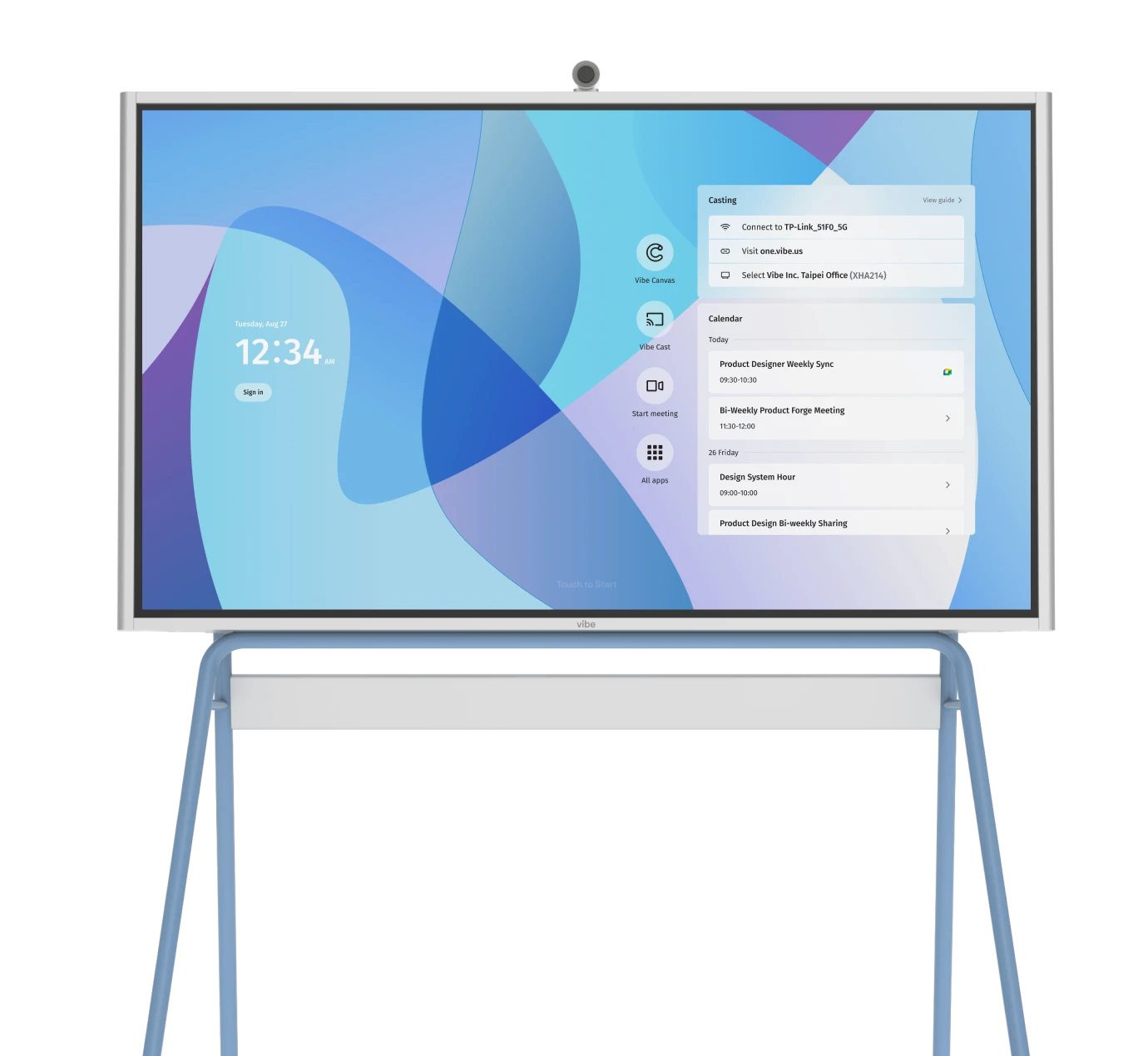
Bring Your KPI Dashboards to Life with Vibe Board S1
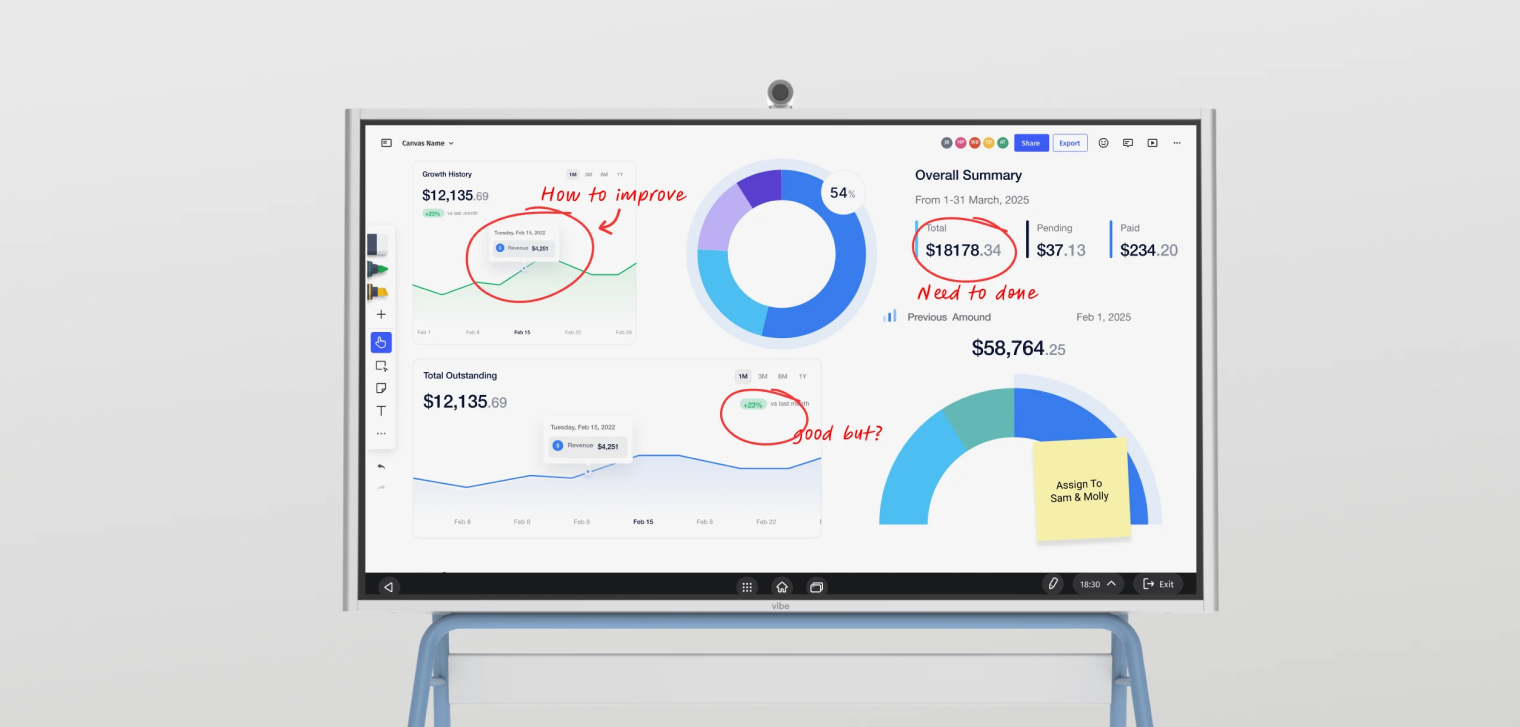
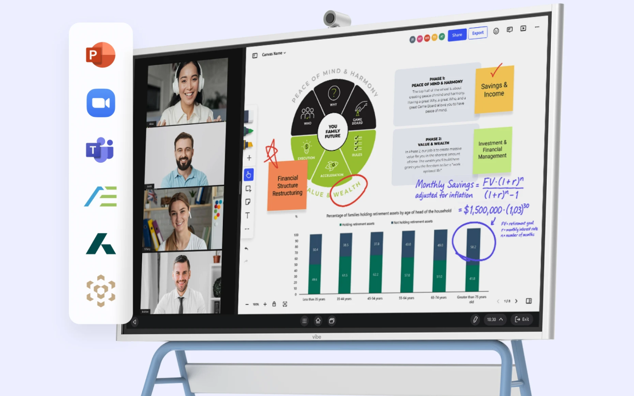
While traditional monitors display your KPI dashboards passively, the Vibe Board S1 transforms them into interactive experiences that drive deeper engagement and faster decision-making. Imagine presenting your quarterly sales dashboard and having team members add annotations directly onto charts, highlight concerning trends with digital markers, or brainstorm solutions right on the screen alongside your data. The smart whiteboard’s crystal-clear 4K touchscreen and multi-user collaboration capabilities turn static dashboard reviews into dynamic strategy sessions where insights lead to immediate action.
Vibe boards integrate seamlessly with popular dashboard platforms like Tableau, Power BI, Google Data Studio, and over 250 other applications, allowing you to display and manipulate your KPI dashboards during meetings without switching between devices or losing momentum. Built-in video conferencing ensures remote team members can participate fully in dashboard discussions, while cloud integration automatically saves annotated insights and action items for follow-up. Whether you’re conducting executive reviews, departmental check-ins, or sales presentations, the Vibe elevates your KPI dashboards from passive viewing experiences to collaborative tools that drive results.
Ready to see how interactive technology can transform your dashboard meetings and enhance team communication? Request a demo today to discover how the Vibe Board S1 can turn your KPI dashboards into powerful engines for collaborative decision making and measurable business growth.
 Using the Vibe Smart Whiteboard to present dashboards visually and clearly, reducing presentation fatigue and impressing high-value clients.
KPI Dashboard FAQs
What does KPI mean?
KPI stands for Key Performance Indicator, which is a quantifiable measurement that demonstrates how effectively a company is achieving key business objectives. KPIs are specific metrics that organizations use to evaluate success at reaching targets and guide strategic decision-making across different departments and functions.
What are the 4 P’s of KPIs?
The 4 P’s of KPIs are People, Process, Performance, and Purpose, which serve as a framework for selecting and implementing effective performance indicators. People refers to the human resources and skills involved, Process covers the workflows and procedures being measured, Performance represents the actual results being tracked, and Purpose ensures alignment with broader business objectives.
Which tools are commonly used for creating KPI dashboards?
Popular KPI dashboard tools include Tableau, Microsoft Power BI, Google Data Studio, Databox, and specialized platforms like Geckoboard and Klipfolio. Many organizations also use integrated solutions like HubSpot for marketing dashboards or industry-specific tools, while some create custom dashboards using Excel or Google Sheets for simpler requirements. The choice depends on factors like data complexity, integration needs, user technical skills, and budget constraints.