
End-of-shift OEE reports tell you what happened. They don't tell you what to do about it while the shift is still running.
For manufacturers operating more than one facility, the problem compounds. Each site has its own MES, its own reporting cadence, and its own definition of what gets counted as downtime. By the time plant directors get a consolidated view, the data is hours old, the context is lost, and the decisions that could have prevented losses are no longer available to make.
Real-time OEE dashboards solve the timing problem. Getting them right across multiple sites requires solving the data standardization problem first — and understanding what the display layer can and can't do on its own.
This guide covers what multi-site OEE tracking actually requires, what to display at each level of the organization, and how to make production visibility work on the shop floor without replacing the systems each plant already runs.
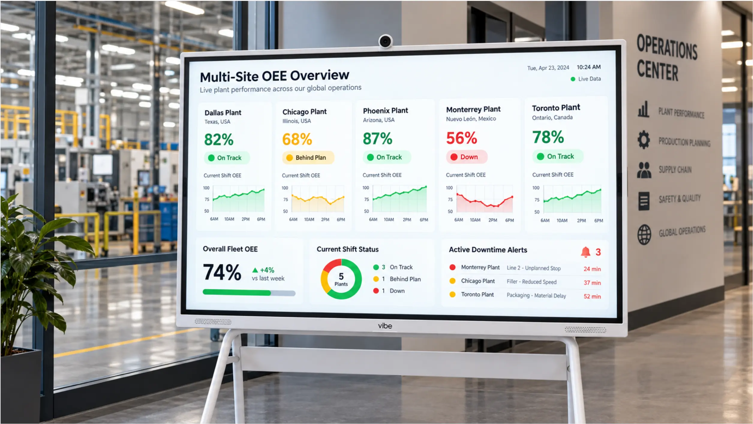 Vibe Board S1 Pro at a plant entrance or operations center showing a multi-site OEE summary — facility names, live OEE percentages, color-coded status, and a trend line for the current shift
What Is OEE, and Why Is It Hard to Track Across Sites?
OEE — Overall Equipment Effectiveness — measures how much of your planned production time is actually producing good output. It combines three factors:
|
Component |
What it measures |
Formula |
|---|---|---|
|
Availability |
Time the equipment ran vs. planned production time |
Run time ÷ planned time |
|
Performance |
Speed during run time vs. ideal speed |
Actual output ÷ theoretical output |
|
Quality |
Good parts vs. total parts produced |
Good count ÷ total count |
OEE = Availability × Performance × Quality
A "world-class" OEE benchmark is frequently cited as 85%. Most manufacturers run significantly below that — industry research commonly places average OEE in discrete manufacturing between 40% and 60%.
The challenge isn't the formula. The challenge is that each plant in a multi-site network often:
-
Uses a different MES or production tracking system
-
Defines downtime categories differently (what one site calls "planned maintenance," another codes as "unplanned stoppage")
-
Reports at different intervals (some real-time, some end-of-shift, some daily)
-
Applies different quality thresholds for what counts as a "good" part
Without standardization across those four dimensions, a multi-site OEE dashboard doesn't give you comparable data — it gives you numbers that look the same but measure different things.
The Three Levels of OEE Visibility
Effective multi-site OEE tracking serves three distinct audiences, each needing a different view of the same underlying data.
1. The Shop Floor (Line-Level View)
Operators and line supervisors need to know, right now: is this machine running, and are we on pace?
The floor-level OEE display shows:
-
Real-time OEE for this line, updated continuously
-
Current output vs. target for the shift
-
Active downtime events — what stopped, when, for how long
-
Reason codes once an operator has logged them
This is the view that drives in-shift response. It needs to be visible from the production aisle without walking to a terminal.
2. The Plant (Site-Level View)
Shift managers and plant managers need a summary across all lines — where are problems concentrated right now, and how is today tracking against target?
The plant-level view shows:
-
OEE by line, ranked or color-coded
-
Cumulative shift output vs. plan
-
Top downtime contributors for the shift in progress
-
Trend line vs. same shift yesterday or last week
This view lives in the plant office or on a shared screen in the operations center.
3. The Network (Multi-Site View)
Plant directors and operations VPs need cross-facility comparability — which sites are performing, which are lagging, and where should improvement resources go next?
The multi-site view shows:
-
OEE by facility, on a single screen
-
Standardized metrics (requires data harmonization — see below)
-
Historical trend by site, week over week or month over month
-
Drill-down to site level for any outlier
This is typically a Power BI, Tableau, or corporate BI dashboard pulled into a shared display or a management review screen.
The Multi-Site Data Standardization Problem
Before displaying OEE across sites, you need to agree on what you're measuring.
Define Downtime Categories Consistently
The most common source of incomparable multi-site OEE data is inconsistent downtime classification. If Site A codes a planned changeover as "downtime" and Site B excludes it from the denominator entirely, their OEE numbers aren't measuring the same thing.
Establish a shared downtime taxonomy:
-
Planned downtime — scheduled maintenance, changeovers, meetings (typically excluded from OEE denominator, but define this explicitly)
-
Unplanned downtime — equipment faults, material shortages, quality holds
-
Minor stoppages — brief interruptions under a defined threshold (e.g., under 5 minutes)
Document the taxonomy centrally, train each site's operators to apply the same codes, and audit periodically.
Standardize Quality Thresholds
What counts as a "good" part? If one site inspects 100% of output and another spot-checks 10%, their quality components aren't comparable even if their actual defect rates are identical. Align inspection methodology before comparing quality-component OEE across sites.
Agree on Planning and Shift Structure
OEE is calculated against planned production time. If one site runs three 8-hour shifts and another runs two 10-hour shifts with a planned 2-hour gap, the denominators differ. Standardize how planned production time is defined and recorded in each site's system.
What to Display on a Multi-Site OEE Dashboard
Once your data is standardized, the display layer is the simpler part. Here's what each view should prioritize:
Floor Screen (Line-Level)
-
OEE percentage, large and center
-
Output actual vs. target — current shift
-
Machine status: running / stopped / alert (color-coded)
-
Current downtime event: reason code + elapsed time
-
Shift trend sparkline — are we recovering or falling further behind?
Keep this view readable at 20–30 feet. One or two lines per screen, maximum four. Supervisors should be able to read it while walking past.
Plant Operations Screen (Site-Level)
-
All lines in one view, ranked by current OEE
-
Top 3 downtime contributors — shift total
-
Output by line: actual vs. plan
-
Shift performance vs. same shift last week
This view is typically reviewed in the daily shop floor meeting and updated live during shift handover.
Corporate or Multi-Site View
-
One row per facility: site name, current OEE, shift status, trending up/down
-
Last 30-day OEE trend per site
-
Output attainment vs. plan — week-to-date
-
Flagged sites: any facility below a defined OEE threshold
This view is usually a Power BI or Tableau dashboard embedded in a shared screen or reviewed in the weekly operations call.
How to Set Up Multi-Site OEE Tracking Without a New Platform
Most manufacturers considering a multi-site OEE dashboard assume they need to replace existing MES systems or deploy a new enterprise platform. In most cases, neither is required.
Step 1 — Audit What Each Site Already Has
Start with an honest inventory:
-
What does each site use to track production? (MES, SCADA, manual spreadsheets, OEE-specific tools like Vorne or Tractian)
-
Does each system export data in a usable format? (API, database query, CSV export)
-
How often is data available? (Real-time, every 15 minutes, end-of-shift)
This audit tells you what your dashboard can realistically display — and where data gaps require process changes rather than technology changes.
Step 2 — Build a Standardization Layer
Connect each site's data to a centralized reporting layer. Common approaches:
-
Power BI — each site's MES or OEE tool exports to a shared Power BI dataset; the report applies standardized definitions and refreshes on a defined schedule
-
SQL database — a lightweight central database aggregates data from each site; dashboards query from there
-
OEE platform with multi-site capability — tools like TeepTrak or Vorne have native multi-site views; if multiple sites already use the same platform, this is the simplest path
The standardization layer is where you enforce consistent downtime taxonomy, quality thresholds, and planned-time definitions. Without it, the dashboard shows you numbers; with it, it shows you comparable metrics.
Step 3 — Display at the Right Level in Each Location
The reporting layer feeds the display layer. How you display it depends on where it's being viewed:
-
Floor screens — need real-time or near-real-time data (sub-5-minute refresh), large format, readable at a distance
-
Plant office or ops center — can tolerate slightly longer refresh cycles; may include more historical context
-
Corporate or multi-site view — often a daily or shift-summary view, displayed in executive dashboards or reviewed in weekly calls
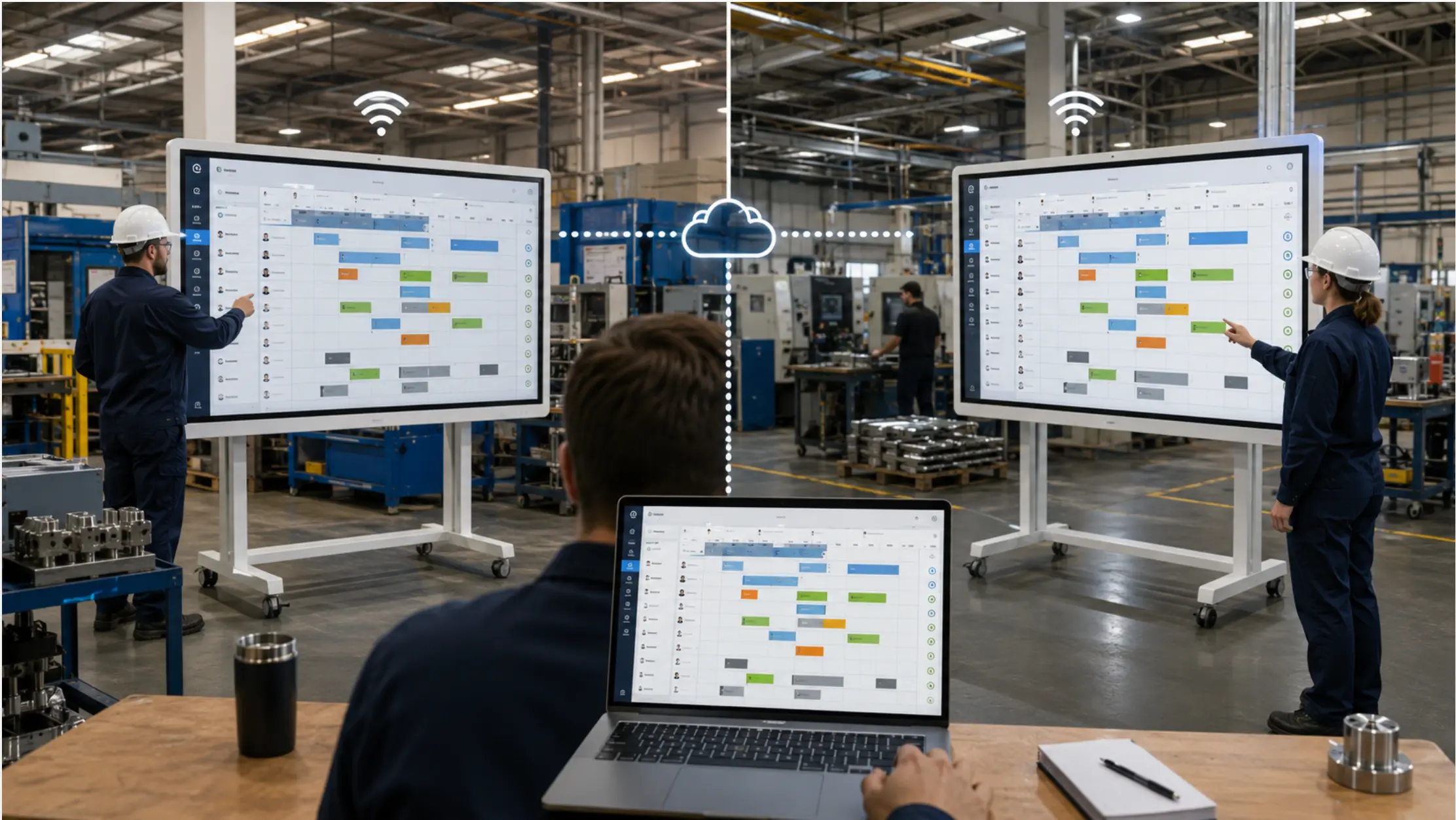
Vibe Board S1 Pro handles the floor and plant-office display layer. It runs a browser-based or Power BI dashboard in a secure kiosk-style mode, displays live data from whatever source your standardization layer publishes, and allows supervisors to interact with the data directly on screen — pulling up drill-downs, annotating issues, or switching between line views — without needing a separate computer.
Step 4 — Establish a Review Cadence
A dashboard without a review process is a screen people stop looking at. Structure the use of the data:
-
In-shift: floor supervisors monitor the real-time view and respond to alerts
-
Shift handover: outgoing and incoming supervisors review the site-level summary together
-
Daily: plant manager reviews prior day by site, flags outliers
-
Weekly: operations director reviews multi-site trends, identifies where improvement resources should go next
The dashboard shows what's happening. The review process determines what gets done about it.
Vibe Board S1 Pro as the Floor Display Layer
Vibe is not an OEE calculation engine. It doesn't replace TeepTrak, Vorne, Tractian, or your MES. What it provides is the display layer — a large, interactive screen at the line or in the plant office that shows whatever your OEE or BI system is already publishing.
This matters because the tools that calculate OEE well (Vorne, TeepTrak, Tractian) are often designed for data collection and analysis, not for large-format floor display. Their interfaces are built for desktop or tablet use. Getting that data onto a 75″ screen at the end of the production line — where operators can see it without walking to a terminal — typically requires a separate display device.
Vibe Board S1 Pro fills that gap:
-
Runs a full browser or Power BI display in kiosk mode
-
Connects to your existing OEE platform via a web embed or API-fed dashboard
-
Allows touch interaction for drill-down and acknowledgment without a separate terminal
-
Displays consistently at large format without the fan noise or reliability issues of repurposed consumer TVs
Summary
Tracking OEE across multiple manufacturing sites requires solving two distinct problems. The first is data standardization — ensuring that the OEE number from Site A means the same thing as the number from Site B. The second is display — getting that data in front of the people who need to act on it, at the right level of detail, in the right location.
Neither problem requires replacing what each site already runs. The standardization layer connects existing systems and enforces consistent definitions. The display layer — a Vibe Board S1 Pro at the line, a Power BI report in the plant office, a corporate dashboard in the weekly operations call — shows the output where decisions get made.
Start with one site, get the definitions right, then expand. A multi-site OEE rollout done in six months with clean data is worth more than an enterprise-wide deployment done in six weeks with numbers that don't compare.
Common Mistakes in Multi-Site OEE Rollouts
Comparing sites before standardizing definitions. The most common mistake. An OEE dashboard that compares Site A's 78% to Site B's 61% looks useful but may be meaningless if the two sites classify downtime differently. Fix the taxonomy before publishing the comparison.
Displaying too much on the floor screen. A floor screen with 12 metrics, three trend lines, and a data table is not a floor screen — it's a BI dashboard that nobody reads while walking past. Limit floor-level views to the four or five numbers that drive in-shift decisions.
Treating the dashboard as the improvement. Publishing an OEE dashboard doesn't improve OEE. What changes performance is the response to what the dashboard shows — faster downtime response, structured root cause analysis, and targeted maintenance. The dashboard enables better decisions; it doesn't make them.
Ignoring data latency. A "real-time" OEE dashboard that actually refreshes every 30 minutes is a reporting system, not an operational tool. Know your refresh rate, and be honest with floor users about what "live" means for your system.
Frequently Asked Questions
What is OEE and why does it matter for multi-plant manufacturers?
OEE (Overall Equipment Effectiveness) measures how much of your planned production time is producing good output — combining availability, performance, and quality into a single metric. For multi-plant manufacturers, OEE provides a standardized way to compare performance across facilities and identify where improvement resources will have the most impact, provided the underlying definitions are consistent across sites.
How often should an OEE dashboard refresh on the shop floor?
Floor-level OEE displays should refresh at least every 1–5 minutes to be useful for in-shift decisions. End-of-shift summary views can refresh less frequently. The refresh rate depends on how often your data source (MES, OEE platform, or sensor layer) publishes new data — the dashboard can't update faster than the underlying data source allows.
Do we need a new MES to track OEE across multiple sites?
Usually not. Most multi-site OEE dashboards aggregate data from each site's existing systems — MES, SCADA, OEE tools, or even structured spreadsheets — into a central reporting layer like Power BI. The work is in standardizing definitions and building the data pipeline, not replacing each site's existing tracking infrastructure.
What's the difference between an OEE dashboard and an andon board?
An OEE dashboard is primarily a performance analysis tool — it shows efficiency metrics over a time period (current shift, prior day, week). An andon board is an operational alerting tool — it shows what's happening right now and triggers action when something is wrong. Many facilities run both: the andon board for real-time response, the OEE dashboard for shift review and trend analysis.
How do we make OEE data comparable across sites that use different MES systems?
By building a standardization layer between each site's data source and the reporting dashboard. This layer applies consistent definitions — the same downtime categories, quality thresholds, and planned-time calculations — regardless of what each site's underlying MES records natively. Power BI is a common tool for this because it can ingest from multiple data sources and apply transformations before displaying the data.
What should a floor-level OEE display show vs. a management-level view?
Floor-level: real-time OEE, output vs. target, active downtime event and elapsed time. Readable at a distance. Four to five numbers maximum. Management-level: cross-line or cross-site comparison, historical trends, top downtime contributors, attainment vs. plan. More data, smaller format, designed for review in a meeting context rather than a floor walk.